
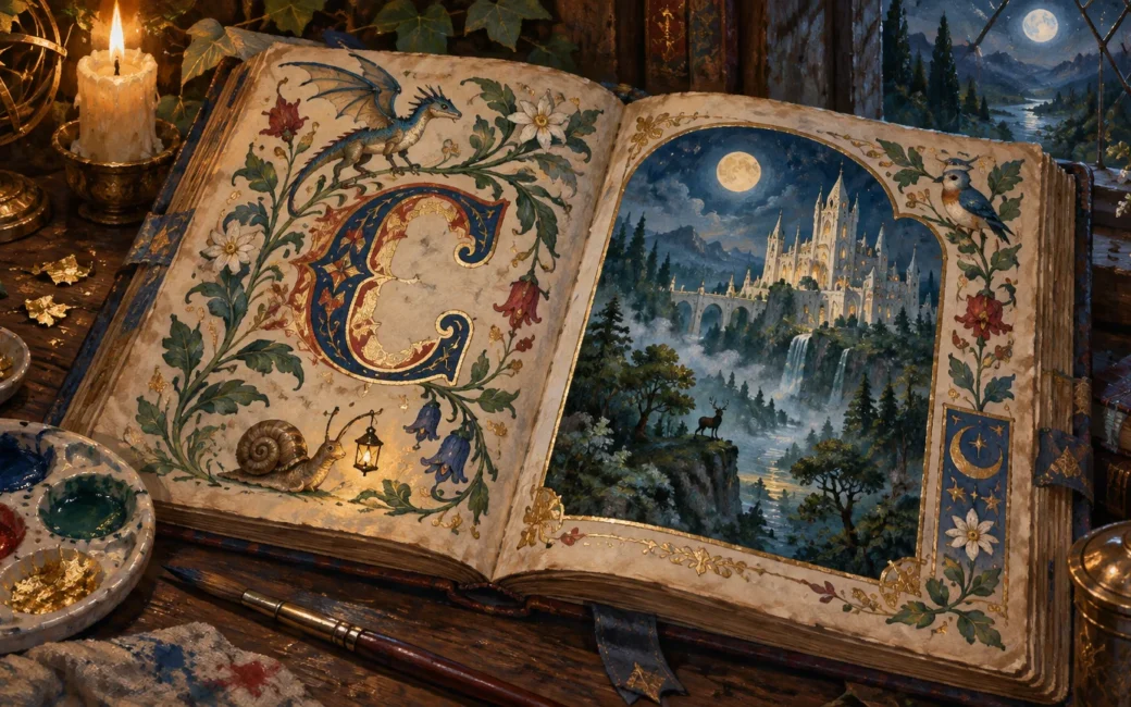
TLDR: To understand fantasy art medieval manuscript influence, study the logic of the page rather than adding generic parchment textures. Medieval makers coordinated script, framed images, decorated initials, borders, margins, ornament, and precious materials. A modern artist can reinterpret those relationships with original characters, symbols, lettering, and stories.
The most convincing fantasy art medieval manuscript influence often appears before the viewer notices a dragon, knight, or vine. It appears in the hierarchy of the page: where the eye enters, how an initial announces a passage, where an image interrupts the text, and how a border turns empty space into an active visual zone. The result feels manuscript-inspired because words and pictures belong to one designed object.
Manuscript influence is a visual system, not an aged surface
A beige ground, rough edges, and a blackletter-like font can suggest age, but they do not reproduce the visual intelligence of a manuscript page. Surface effects say, “This object is old.” Page structure says, “This object was made to organize reading, looking, ceremony, and storytelling.” That second idea gives fantasy artists much more to work with.
Getty describes medieval manuscript design as a coordinated practice involving text, ornament, imagery, and page layout across individual pages and complete books. Its useful overview of graphic design in medieval manuscripts shows why these books can be studied as designed environments rather than loose collections of pictures.
That environment creates hierarchy. A large decorated initial can mark an important beginning. A miniature can pause the text for a concentrated narrative scene. Repeated border motifs can unify separate pages. A marginal creature can introduce humor, tension, commentary, or simply a second point of visual attention. The page does not have to imitate natural space because its primary space is the folio itself.
What “illuminated manuscript” means
Medieval illuminated manuscripts can contain miniatures, ornamental borders, elaborate chapter letters, and full-page paintings. Gold leaf is also part of the material history behind illumination’s association with light. The term therefore refers to decorated manuscript books and their material construction, not every contemporary fantasy picture that uses an old-paper effect.
For modern work, “manuscript-inspired” is often the more accurate description. A digital illustration with a painted gold color, invented script, and ornamental frame may draw on the appearance or design principles of illumination without using historical materials or following a historical workshop process. That distinction lets the artist acknowledge a source of visual ideas without making a false claim about technique.
It is also worth narrowing the geographical claim. This article discusses selected medieval European manuscript traditions frequently referenced in modern Anglophone fantasy culture. Manuscript cultures existed far beyond that scope, each with histories that deserve specific study rather than being folded into a vague medieval category.
The manuscript-derived traits to look for
Framed scenes instead of open windows
Many contemporary fantasy illustrations are built like windows onto a continuous world. A manuscript-inspired composition can behave differently. It may treat the picture as a bounded compartment surrounded by text, pattern, columns, or a strong geometric frame. Figures can press against that boundary, overlap it, or remain deliberately contained within it.
This approach changes the sense of space. Deep atmospheric perspective becomes optional. A castle, beast, and rider can be arranged for legibility and symbolic weight rather than placed at physically convincing distances. The largest shape may be the most important narrative element, not the object closest to an imagined camera.
Decorated and historiated initials
An initial can be ornamented with pattern, foliage, animals, or abstract structures. It can also hold a scene or figure, turning a letter into a small narrative enclosure. In fantasy art, that device can announce a chapter, faction, spell, location, or character while linking written language to worldbuilding.
The key is integration. If the initial looks pasted onto a finished image, it functions as decoration. If its scale affects the text block, its color reappears elsewhere, and its silhouette helps direct the eye, it becomes part of the composition.
Active borders and margins
A border does not need to be a symmetrical strip of vines. It can establish visual rhythm through repeated leaves, knots, shields, stars, architectural forms, or invented creatures. Small breaks in that rhythm become meaningful: a fox entering from the lower edge, a root curling around a letter, or a tiny traveler moving toward the central scene.
Margins are especially useful for secondary storytelling. A central image might show a ruler confronting a monster while the lower margin reveals a messenger fleeing with an egg. The detail rewards close viewing without competing with the main action. It can also suggest that the fictional page was made by someone with opinions, humor, or incomplete knowledge.
Patterned fields and selective depth
A patterned background can replace an illusionistic sky. Repeated dots, stars, diamonds, or botanical shapes flatten the space and give silhouettes greater importance. Because the background is visually active, the foreground figures need clear outer contours and a controlled value structure—the arrangement of light and dark shapes.
This does not forbid depth. A page can combine flatter patterned zones with modeled faces, overlapping figures, or architectural recession. The tension between decorative surface and represented space is often what makes the composition feel distinct from a conventional cinematic fantasy scene.
Gilded focal points
Gold is most effective when it has a job. It can mark a halo, crown, weapon, celestial body, initial, frame corner, or trail of magic. Concentrating the brightest accent around one narrative idea gives the viewer a clear entry point. Spreading simulated gold evenly across every ornament may make the page expensive-looking, but it weakens hierarchy.
For digital work, the goal is not to pretend a flat yellow fill is real leaf. Artists can instead observe how a reflective material changes with viewing conditions and then decide what role a gold-like accent will play in the image. A restrained warm shape against cool blue, green, or violet passages can provide enough emphasis without turning every surface metallic.
Why there is no single medieval manuscript style
Medieval books varied by period, place, purpose, patronage, and production setting. The Metropolitan Museum of Art notes both changes in production context and distinctive developments in Northern European illumination, including the move from early monastic production toward coordinated urban book production by the twelfth century. Treating all medieval European manuscripts as one uniform look erases those differences.
Labels such as Insular, Romanesque, Gothic, and late medieval can be useful starting points for research, but they should not become preset filters. An artist working on an original project can use them as four investigative pathways:
- For Insular material, ask how dense pattern, lettering, interlace, and page-scale ornament organize attention in the specific objects being studied.
- For Romanesque material, examine how the selected manuscript handles strong contour, compressed space, gesture, and narrative clarity rather than assuming every work shares those traits equally.
- For Gothic material, compare how individual pages coordinate architecture, figures, script, framing, and increasingly complex spatial cues.
- For late medieval Northern European courtly illumination, look closely at elegant, sinuous figures, decorative color, and detailed observations of plants, animals, and insects identified by the Met around 1400.
These are research prompts, not complete definitions. Before adopting a motif, inspect dated and localized objects from museum collections. Note the manuscript, folio, approximate date, place of production when known, holding institution, and the particular feature you are studying. Object-level notes are more reliable than a mood board labeled simply “medieval.”
How to reinterpret the influence without copying a page
Historical study works best when the artist separates a visual principle from its original content. Instead of reproducing a specific border, identify what it does: repeats a rhythm, marks hierarchy, contains text, joins corners, or creates a place for secondary figures. Then rebuild that function with forms belonging to the new fantasy world.
For example, a coastal kingdom might use borders built from tide marks, shells, knotted rope, and long-beaked marsh birds. A volcanic archive might organize its initials around cracked geometric forms, ash-dark lettering, and narrow flashes of copper. Neither design needs to reproduce an existing folio. The historical reference supplies a method of integrating text and image; the fictional culture supplies the symbols.
Keep a source record for every reference image, especially if the finished piece may be published or sold. Museum object pages can support study, but the reuse terms for photographs and digital files still need to be checked individually. The same source discipline matters when combining modern assets, as explained in this guide to reference licensing and visual cohesion in fantasy art.
- Collect references from several manuscripts rather than building the project around one famous page.
- Write down the structural feature you want to learn from each source, such as margin rhythm, text-image balance, or focal use of gold.
- Invent new characters, heraldry, creatures, lettering, and narrative incidents for the fantasy setting.
- Change the proportions and relationships between elements instead of tracing the source arrangement.
- Review the result without its parchment texture. If the manuscript influence disappears, strengthen the layout rather than adding more artificial aging.
A one-page fantasy folio exercise
Start with a fictional passage of 80 to 120 words. It could describe a pilgrimage, coronation, monster sighting, astronomical event, or disputed historical episode. The text does not need a complete alphabet of invented calligraphy; a readable display initial and a restrained text treatment are enough.
- Rule the page into a main text area, one image compartment, and a margin wide enough to carry secondary detail.
- Choose one sentence as the narrative center. Design the main scene around that moment, using a clear silhouette for its most important figure.
- Enlarge the passage’s first letter. Let its colors, pattern, or internal scene establish motifs that recur elsewhere on the page.
- Create a border from three or four forms tied to the fictional culture. Repeat them with controlled variation rather than drawing unrelated decoration around every edge.
- Add one marginal incident that changes how the reader interprets the main story. It might contradict the official account, foreshadow danger, or show an ordinary person affected by the event.
- Reserve the brightest or most reflective-looking accent for one focal area. Check that it remains meaningful at thumbnail size.
- Test readability. If ornament interrupts every line or creates false letter shapes, simplify it or move it away from the text block.
For a card-sized composition or RPG handout, reduce the number of competing devices. One initial, one framing system, and one marginal figure will usually communicate the idea more clearly than several tiny scenes. Small formats make negative space—the unoccupied area around forms—particularly important because every ornament consumes reading room.
Let the page logic create the historical feeling
A manuscript-inspired fantasy image does not need cracked paper, pseudo-archaic spelling, or ornament on every surface. Its strongest historical echo can come from a more fundamental choice: treating text, image, border, material accent, and empty space as parts of one visual system.
Begin the next piece by choosing one structural device, not an entire period costume. Build a narrative initial, design an active margin, frame a scene against a patterned field, or reserve a gold-like accent for the story’s central symbol. Then study specific historical objects to refine that choice. The result will feel informed by manuscript design while remaining visibly rooted in an original fantasy world.