Open post
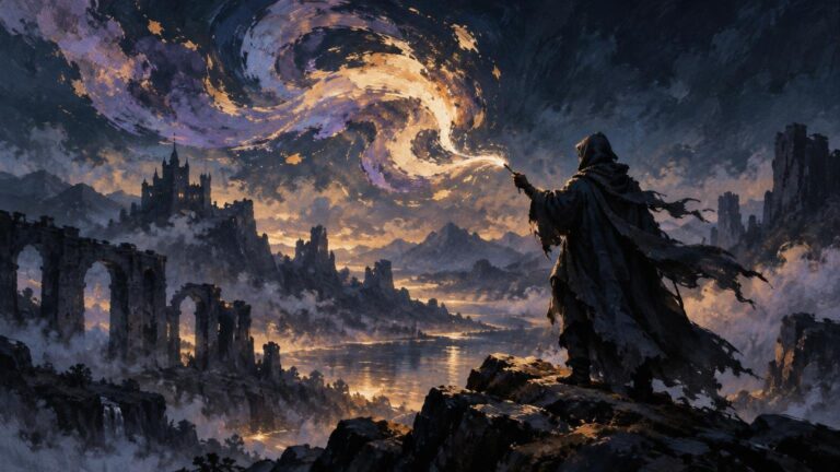
Painterly fantasy scene of a hooded figure on a rocky cliff casting a bright swirling spell over ruined arches, distant mountains, a castle, and a reflective valley at dusk.

How to Make Magic Effects Feel Painterly Instead of Glossy

TLDR

The short answer to how to make magic effects feel painterly instead of glossy is to treat magic as designed light rather than a luminous overlay. Establish a readable value mass, divide it into intentional shapes, vary hard and soft edges, break the color subtly, and let the light affect nearby forms. Use blur, bloom, particles, and bright blend modes only where they reinforce that structure. Painterly glow comes from selective decisions, not from avoiding digital tools.

A glossy spell is not automatically a bad spell. Smooth gradients and polished bloom can suit magical technology, force fields, polished crystals, or an intentionally synthetic world. The problem appears when every effect receives the same airbrushed center, symmetrical halo, repeated sparkles, and pure-white highlight. The magic may be bright, but it no longer feels particular to the scene.

Why painted magic starts looking plastic

Glossiness usually comes from uniformity. A soft brush deposits an even gradient. A bright blend mode increases saturation. A blur removes awkward transitions. A particle brush fills empty space. Each choice can be useful, but together they can replace the irregular hierarchy found in a painted passage with one generalized finish.

Common warning signs include a halo of equal width around the entire effect, identical sharpness on every contour, a large white center with no internal shape, and sparks repeated at similar sizes or intervals. Another clue is isolation: the spell glows intensely while the hand, face, floor, smoke, and armor around it remain unaffected.

Before repainting, temporarily hide the bloom, particles, and color-enhancing layers. Squint at what remains. If the underlying effect has no convincing silhouette or value pattern, adding more glow will usually make the weakness brighter rather than solve it.

Start with value, not luminosity

A glowing effect does not need a large area of pure white to feel bright. It needs a convincing relationship between its lightest mass and the surrounding values. Darkening or simplifying the immediate background can make a moderately light spell feel more luminous while leaving room for a few genuinely bright accents.

Block the effect in grayscale or temporarily inspect the image without color. Aim for three broad groups: the main luminous mass, a secondary transition around it, and the surrounding scene. The main mass should remain identifiable at thumbnail size. If it disappears without its saturated color, its value design may be too weak.

Reserve the highest values for a small focal region, such as the point where energy leaves a hand, the center of a rune, or the hottest bend in a flame-like ribbon. Protecting that contrast gives the eye a destination. Instruction on painting light likewise emphasizes designed light and shadow shapes rather than relying on all-over airbrushing. Proko’s light-and-form lesson is a useful demonstration of that broader principle.

Build the spell as a family of shapes

Think from large to small. Begin with one large silhouette that establishes the effect’s direction and character. A healing spell might rise in open, upward arcs. A binding spell could use compressed loops and crossings. A volatile projectile might lean forward with a broken trailing edge.

Add a limited number of medium shapes inside or around that silhouette: ribbons, flame tongues, fractured planes, smoke-like folds, branching currents, or incomplete symbols. These forms should reinforce the same movement rather than compete as separate ideas. Only then add small accents such as sparks, chips, droplets, or sharp highlights.

This hierarchy makes the effect readable before texture is introduced. It also prevents a frequent problem with particle brushes: dozens of tiny marks describe activity but never establish what the magic is actually doing.

Pass Main question Useful decision
Large shape What is the spell’s overall gesture? Choose one clear silhouette and direction.
Medium shapes How does energy move within it? Add a few related ribbons, breaks, folds, or symbols.
Small accents Where should the eye stop? Concentrate sparks and sharp highlights near the focal action.
Atmosphere How does the effect enter the scene? Add only enough haze or bloom to connect it with nearby space.

Use hard, soft, and lost edges deliberately

Painterly does not mean blurry. A uniformly blurred spell is still uniform; it simply has softer uniformity. Painterly handling becomes visible when different edges perform different jobs.

  • Use hard edges where the effect begins, changes direction, overlaps an important form, or needs to command attention.
  • Use soft edges where light scatters into haze, smoke, hair, fabric, or atmospheric depth.
  • Use lost edges where the spell and its surroundings approach a similar value or color, allowing the form to dissolve temporarily.
  • Place broken edges along unstable or turbulent passages, but avoid making every contour equally ragged.

Edge contrast should follow focal hierarchy. A crisp turn beside a soft plume feels active because the two passages differ. If every edge is sharp, the effect resembles a cutout. If every edge is soft, it resembles fog. Guidance on making digital work feel more traditional similarly recommends varied edges, selective texture, and careful contrast around a light source rather than one repeated treatment across the image. Proko’s guide to a more traditional digital-painting feel provides a broader discussion of those choices.

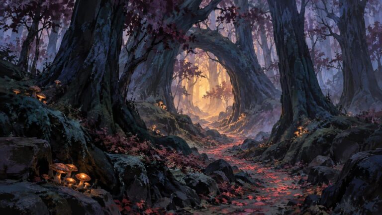
The same rationing principle helps atmospheric fantasy scenes. The method used to preserve contrast and edge hierarchy in a dark fantasy forest without losing atmosphere can also keep luminous magic readable without sharpening the entire painting.

Break the color without turning it into noise

A glossy effect often moves through a perfectly smooth sequence: white center, saturated local color, darker halo. To make that progression feel painted, interrupt it with controlled temperature and hue changes. A blue spell might contain a colder cyan near one turn, a muted violet in a thinner passage, and a small warmer reflection where it meets skin or bronze.

These shifts should describe form, material, or emphasis. Random color variation creates confetti rather than richness. Keep the broad color family coherent, then introduce differences where planes turn, strands overlap, or the effect passes through smoke and atmosphere.

Combine opaque and transparent marks. Opaque strokes give the luminous mass weight and make brush decisions visible. Transparent passages create diffusion and colored air. If the entire effect is transparent, it may resemble tinted glass; if it is entirely opaque, it may feel like a solid object. The tension between the two helps magic occupy an uncertain state.

Make texture selective

Textured brushes can break a sterile gradient, but one visible stamp repeated everywhere merely replaces smoothness with patterned noise. Change brush size, pressure, angle, and stroke length. Let some areas remain quiet so the textured passages have something to contrast against.

Use texture where it communicates behavior: dry breakup at the edge of dusty magic, dragged strokes in a fast-moving stream, granular marks in embers, or rough interruptions where energy meets stone. Avoid covering the entire halo with the same grain. Painterly texture should belong to the spell’s motion and substance, even when that substance is imaginary.

A Photoshop-specific option

Photoshop’s textured-brush controls can vary paint deposition through settings including texture scale, depth, and pen-pressure-based variation. These controls can help one stroke alternate between fuller and broken coverage, but they are not a painterly shortcut. The useful question remains where that variation belongs. Adobe’s textured-brush documentation explains the available controls; use them to support a designed mark rather than to texture every surface equally.

Integrate magical light with the scene

A convincing glow changes nearby forms. Identify which planes face the source and add restrained illumination there. On a face, that could mean the underside of the brow, the near plane of the nose, the fingers, and the edge of the jaw. On armor, the response may be narrower and sharper. Cloth generally benefits from broader changes that follow its folds rather than a generic bright outline.

Do not rim-light every visible contour. Rim light is most effective when it is selective, and equal rendering across an image weakens hierarchy. Let some surfaces receive the spell strongly while others turn away or fall behind an occluding form. A foreground hand, staff, sleeve, or strand of hair can interrupt the effect and make it feel located in space.

Cast light should also respect distance and obstruction. The nearest plane generally deserves the clearest response, while more distant surfaces can receive weaker, broader color. Dark interruptions near a bright source can be especially useful: fingers crossing an orb, a figure standing before a portal, or debris passing through a luminous cloud gives the eye a scale and depth cue. For larger environments, the same overlap and atmospheric principles described in building depth in fantasy landscapes can organize the space around the effect.

Use bloom as support, not structure

Bloom can create atmosphere and communicate intensity, but it should sit on top of an already readable design. Add it late. Keep it narrower near important hard edges and broader where the effect disperses into smoke or distance. If bloom erases the shape that made the spell distinctive, reduce it.

The same applies to Screen, Add, and Color Dodge layers. They can accelerate luminous color, but they do not decide where the focal point belongs, how energy moves, or which surfaces receive light. You can paint convincing glow on normal layers by controlling values and color relationships. Blend modes are optional finishing tools, not the source of illumination.

Finish with subtraction

The final pass should often remove more than it adds. View the image at its intended display size, especially if the illustration may appear as card art or a small portfolio thumbnail. Fine particles and subtle texture that look exciting while zoomed in can merge into static at reduced scale.

  • Delete sparks that repeat the same size, spacing, or direction.
  • Reduce saturation in secondary halos so the focal color remains distinct.
  • Remove highlights that do not clarify a turn, overlap, impact, or source.
  • Restore selected dark gaps inside and around the effect.
  • Check that one or two edge changes carry more emphasis than the rest.
  • Compare the image with the bloom layer hidden; the underlying spell should still read.

A restrained surface pass also leaves room for the surrounding painting. If the effect, character, costume, and background all receive equal texture and equal sharpness, the image loses hierarchy. Selective completion is part of the painterly look, not evidence that every area needs another rendering pass.

A repeatable repaint exercise

Choose an existing glossy orb, portal, enchanted weapon, or spell layer and duplicate the file. Hide its bloom and particle layers. Reduce the effect to one large value shape, then cut into that mass with two or three darker interruptions. Add a handful of medium directional marks, varying their edges according to focus and diffusion.

Next, introduce two or three controlled color shifts instead of one perfectly smooth gradient. Add opaque texture to selected passages and transparent haze to others. Paint the light response on the nearest skin, cloth, metal, ground, or smoke. Finish with only a few sharp highlights and particles, then inspect the result at thumbnail size.

The goal is not to eliminate polish. It is to make polish subordinate to drawing, value, shape, edge, and color. When those decisions remain visible, magical light can feel bright and atmospheric without becoming a plastic sticker laid over the painting.

The practical takeaway

When a magic effect feels too glossy, do not begin by searching for a different glow brush. Turn off the finishing effects and repair the underlying value mass, silhouette, and edge hierarchy first. Then restore color, texture, cast light, particles, and bloom selectively. The visual choice doing the most work should be the spell’s designed shape—not the filter surrounding it.

References

  1. Proko – Painting Light and Form (4 STEPS) – Extended Edition
  2. Proko – How to Make Digital Paintings Look Traditional
  3. Create textured brushes in Photoshop | Photoshop
  4. Proko – Bringing Surfaces to Life

Open post
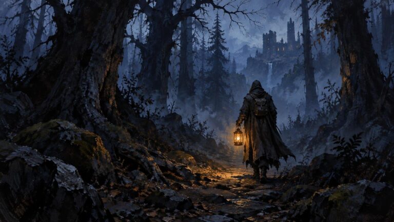
Moonlit dark forest with gnarled trees framing a rocky path and a standing stone in misty woodland.

How to Paint a Dark Fantasy Forest Without Losing Atmosphere

TLDR

To understand how to paint a dark fantasy forest without losing atmosphere, treat darkness as selective concealment rather than a blanket of black paint. Begin with three to five value groups, divide the forest into depth planes, and reserve the strongest contrast, sharpest edges, and clearest details for one focal event. Build trees as overlapping masses before adding trunks or foliage. Soften and simplify distant forms, place mist between selected layers, and remove any highlight or texture that competes with the focal point.

A convincing dark forest does not show everything equally. It gives the viewer one clear route into the scene while allowing other forms to emerge slowly or remain unresolved. The central question is not simply how dark the painting can become. It is which information must survive the darkness.

Decide what the darkness is allowed to hide

Before painting, establish a visibility rule. Decide what the viewer should recognize immediately, what should become apparent after a few seconds, and what should never fully resolve. This hierarchy creates mystery without sacrificing readability.

The immediate read might be a pale path beneath an arch of trees, a ruined doorway, a moonlit pool, a lantern-bearing figure, or a magical glow behind tangled roots. Secondary discoveries could include a distant tower silhouette or a shape that might be a creature. Bark patterns, scattered leaves, and minor branches can remain submerged in shadow.

Also choose a lighting condition. A moonlit nocturne, dim gothic daylight, red magical illumination, and colorless fog all produce different value relationships. Avoid combining several unrelated lighting ideas unless one is clearly dominant. One governing source makes it easier to decide which planes are visible and which edges disappear.

Start with a small value thumbnail

Reduce the composition to three to five values before thinking about color. At thumbnail size, test whether the focal point remains visible and whether the forest reads as layered space rather than one dark wall.

  1. Place the largest dark mass. This may be the foreground canopy, a bank of trunks, or a framing shape along one side.
  2. Establish a middle value that separates important trees, ground planes, mist, or architecture from the darkest mass.
  3. Choose one lighter opening or illuminated form to direct attention.
  4. Add a small, controlled dark accent inside or beside the light area if the focal subject needs a stronger silhouette.
  5. Squint at the thumbnail or view it at a reduced size. If every shape merges, adjust the value groups before adding detail.

The lightest value does not have to be white, and the darkest does not have to be black. What matters is the relationship between them. A restrained range can feel deeply nocturnal if the focal contrast is clear. Conversely, a painting containing pure black and bright white can still feel flat when those extremes are scattered everywhere.

Build the forest as three depth planes

A practical starting structure is foreground, middle ground, and distance. More complex paintings may contain additional layers, but the three-plane model makes the first decisions manageable.

Plane Primary job Useful treatment
Foreground Frame the view and establish enclosure Large connected silhouettes, cropped forms, limited internal detail
Middle ground Carry the focal event and visual route Clearest shapes, strongest useful contrast, selective texture
Distance Extend the space and preserve uncertainty Lower contrast, softer edges, simpler shapes, fewer details

The foreground can be extremely dark, but it should still have a designed silhouette. A solid black strip across the bottom often feels pasted onto the painting. Instead, vary its contour with roots, rocks, hanging branches, or openings that point toward the middle ground. Negative space is as important as the trees themselves.

Use overlap and changes in apparent scale to clarify which forms sit in front of others. The Getty’s landscape teaching materials identify overlap and relative scale as spatial cues, while its description of atmospheric perspective includes reduced detail, softer outlines, lower contrast, and shifts in saturation or color in distant forms. The Getty’s landscape curriculum provides a useful overview of these depth devices. For a broader application of the same principles, see this guide to creating depth in fantasy landscapes.

Paint tree masses before individual trees

Repeated vertical trunks can make a forest resemble a fence. Begin instead with connected masses: a dense canopy shape, a leaning wall of growth, an arch over the path, or a cluster broken by a narrow opening. Cut trunks and branches into or out of those masses only after the large pattern works.

Vary the rhythm of the verticals. Combine thick and thin trunks, alter their spacing, interrupt some with shadow, and let others merge into the canopy. A few diagonals can imply fallen limbs or unstable growth, but too many create visual noise. The goal is organized irregularity rather than random marks.

Silhouette design can carry much of the fantasy character. Narrow, upward-reaching forms may feel severe or cathedral-like. Low, interlocking boughs can make the space oppressive. Exposed roots can direct the eye like paths, while rounded masses create a quieter, older woodland. These are visual effects, not fixed emotional rules, so test them against the specific story of the scene.

Use atmospheric perspective without turning everything blue

Atmospheric perspective is often reduced to the advice that distant forms should become lighter and bluer. That can work in daylight, but it is not a universal formula. In a dark fantasy forest, recession may come primarily from reduced contrast, softer edges, less saturation, and simpler silhouettes. The distance can remain dark if it is still differentiated from the foreground.

For example, a near-black foreground trunk might sit against a muted middle-ground fog bank. Behind that, distant trees could be a narrow range of cool gray-green values. The distance is not necessarily bright; it is simply quieter. If the background contains sharper edges and stronger contrast than the focal middle ground, it may jump forward regardless of its color.

A useful test is to compare adjacent planes. If the foreground, middle ground, and distance all have the same value range and edge sharpness, depth will collapse. Change at least two variables between the planes: contrast and detail, edge and saturation, or scale and overlap.

Make edge control carry the atmosphere

Edges determine how quickly the eye identifies a form. Hard edges feel immediate. Soft edges suggest haze, low light, movement, or distance. Lost edges allow a form to merge into its surroundings, leaving the viewer to complete it.

Keep a few decisive edges around the focal area, especially where the subject crosses a contrasting background. Elsewhere, break contours with foliage, shadow, mist, or textured transitions. Avoid tracing every trunk with the same crispness. That turns atmosphere into diagram.

Edge variety can also prevent a dark foreground from becoming a dead shape. Let part of a trunk disappear into the canopy, recover its contour where it crosses a dim sky opening, and lose it again near the ground. The viewer still reads the tree, but the sequence of found and lost edges makes the darkness feel spatial.

Place mist between forms, not over the whole painting

An even gray veil usually reduces depth because it affects every plane in the same way. Treat mist as a shape occupying the environment. It might settle along the ground, pass behind one trunk and in front of another, collect above water, or stream through a gap in the canopy.

Paint the forest structure first, then use mist to interrupt selected forms. Preserve some clear darks in front of it and allow quieter silhouettes to recede behind it. Its outer boundaries should vary: one edge can be soft and diffuse while another becomes more visible where the mist crosses a dark trunk.

Mist can also guide the composition. A pale band curving toward a ruin creates a visual route, while a horizontal fog stripe may stop the eye. Design its direction rather than treating it as a final atmospheric effect.

Ration moonlight or magical light

Selective light is more ominous than universal rim lighting. Decide what the source can plausibly reach, then reveal only the planes necessary for the scene. A moon gap might catch the upper edge of a path and one side of a ruin while leaving nearby trunks unresolved. A lantern should create a compact zone of visibility rather than outlining the entire forest.

Caspar David Friedrich’s circa 1823–30 Forest Interior by Moonlight offers a useful historical reference for studying a shadowed forest interior against a more illuminated distance. The point is not to copy its arrangement, but to observe how a limited light event can give dark foreground forms a readable context.

Magical light permits more stylization, but it still benefits from rules. Choose a source position, decide whether the light is direct or diffused, and repeat its hue only in limited reflections. If every branch receives an equally bright colored accent, the glow becomes decoration rather than illumination.

Keep color subordinate to the value structure

Dark shadows do not need to be made from black alone. A limited family of deep blue-green, violet-brown, muted green, or neutral gray can maintain color relationships inside the darkness. The exact pigments or digital brushes matter less than preserving clear value groups.

Use temperature and saturation to reinforce the focal hierarchy. A restrained cool forest might contain a small warm lantern, while a muted neutral woodland could hold one saturated supernatural accent. Do not rely on vivid color to repair an unclear composition. If the focal point disappears in grayscale, its value relationship probably needs attention.

Friedrich’s circa 1825 Northern Landscape, Spring is another institutional reference worth examining for its restrained palette, mist, and differentiated treatment of near and distant forms. These observations can inform a fantasy scene without implying that the historical work shares the same narrative purpose.

Finish with subtraction rather than more detail

Dark fantasy paintings often lose atmosphere late in the process because every empty area begins to look unfinished. The artist adds bark lines, leaf clusters, sharp twigs, reflected light, and small glowing objects until the original hierarchy disappears.

Make the final pass subtractive. Reduce unnecessary contrast, merge minor shapes, glaze or repaint distracting textures, and soften edges outside the focal zone. Ask whether each visible mark supports depth, directs attention, or strengthens the story. If it does none of those things, it may be weakening the image.

  • Remove isolated bright accents near the outer edges unless they intentionally lead the eye.
  • Merge small shadow gaps into larger connected masses.
  • Soften distant trunks that have become as sharp as foreground forms.
  • Reduce bark and foliage detail outside the middle-ground event.
  • Check the painting at thumbnail size to confirm that the focal route still works.

Troubleshooting common dark-forest problems

The foreground looks like a flat black cutout

Redesign its silhouette and add only a few internal value changes. A barely visible root plane, overlapping trunk, or reflected edge may be enough. Do not brighten the entire foreground.

The shadows look muddy

Re-establish the large value groups instead of mixing more colors into every passage. Mud often results from uncertain hierarchy: too many near-identical darks are being adjusted independently. Reconnect them into broader masses, then introduce limited variation where it describes form.

The forest looks like rows of symbols

Group trunks into irregular clusters, vary their spacing and width, and obscure some with canopy masses. Use overlap so the viewer reads layers rather than a collection of separate tree icons.

The fog has covered everything

Restore clear foreground darks and break the fog into localized shapes. Let it pass behind some forms and in front of others. That alternation is what makes the fog occupy space.

Too many things are glowing

Choose one primary light event and demote the others. Lower their saturation, reduce their surrounding contrast, or remove them. A mysterious forest usually becomes more convincing when illumination feels scarce.

A practical order of operations

  1. Write a one-sentence visibility rule for the scene.
  2. Make several small three-to-five-value thumbnails.
  3. Choose the clearest focal route and divide it into foreground, middle ground, and distance.
  4. Block in large tree and canopy masses without texture.
  5. Establish the main light opening or illuminated subject.
  6. Differentiate the planes through overlap, contrast, edge quality, scale, and detail.
  7. Add mist only where it clarifies layering or guides the eye.
  8. Introduce a limited color-temperature or saturation accent around the focal zone.
  9. Add a small amount of descriptive texture near the focal area.
  10. Finish by removing competing edges, highlights, and details.

Let controlled visibility create the mood

The strongest answer to how to paint a dark fantasy forest without losing atmosphere is to ration visual information. Darkness establishes enclosure, but contrast creates the route. Silhouettes establish character, while overlap and atmospheric perspective create depth. Mist interrupts selected forms, and edge control decides what the viewer discovers first.

Before adding another branch or highlight, return to the visibility rule: immediate, delayed, or unresolved. That single decision can keep an ominous forest readable without explaining away its mystery.

References

  1. Landscapes, Classical to Modern Curriculum (Education at the Getty)
  2. Art & Architecture Thesaurus Full Record Display (Getty Research)
  3. Forest Interior by Moonlight – Caspar David Friedrich — Google Arts & Culture
  4. Northern Landscape, Spring – Caspar David Friedrich — Google Arts & Culture

Open post
Warmly lit fantasy artist’s studio with three large landscape paintings of a glowing forest, mountain castle, and coastal ruins, surrounded by sketch pages, paintbrushes, a palette, books, and lanterns.

Fantasy Artist Portfolio: Show Range Without Looking Unfocused

TLDR: A strong fantasy artist portfolio structure does not need to prove that you can draw everything. It should quickly communicate what you make, which opportunities fit that work, and where a visitor can see relevant examples. Lead with selected finished pieces, divide the work into a few meaningful categories, give each project enough context to be understood, and keep contact information easy to find.

The tension between range and focus is especially visible in fantasy art. One artist may make misty landscapes, armored characters, strange creatures, book-cover compositions, and quiet ink drawings. That variety can be an advantage, but only if the portfolio gives it a readable shape. Otherwise, the visitor has to work out which pieces represent the artist’s current direction and which belong to an earlier experiment.

Define the job of your fantasy artist portfolio structure

Begin with the opportunity you want the portfolio to make easier. The Association of Illustrators advises showing the kind of work you want to be hired to create, while ArtStation’s professional portfolio guide similarly frames selection around the skills required for a target role. The AOI’s guidance for starting illustrators is a useful foundation for this decision.

This does not mean reducing your identity to one subject. It means giving the visitor a clear answer to a practical question: “What could I ask this artist to make?” A portfolio aimed at fantasy book illustration might emphasize narrative scenes, character relationships, cover-shaped compositions, and readable focal points. A tabletop or trading-card portfolio could foreground strong silhouettes, compressed storytelling, creatures, environments, and images that remain legible at a small display size. A game-art application may need role-specific evidence such as character exploration, environment design, or production-ready prop concepts.

A collector-facing artist has a different task. That portfolio may be organized around bodies of work, original worlds, media, or available pieces rather than around a studio role. Titles, physical dimensions, medium, exhibition facts where applicable, and current purchasing or inquiry information become more useful. The underlying work may overlap with a commercial illustration portfolio, but its presentation should serve a different visitor.

Primary audience What the portfolio should clarify Useful emphasis
Publishing and freelance clients What kinds of assignments fit the artist Finished narrative images, cover compositions, spot illustrations, accurate public credits
Game or entertainment-art recruiters Which role and production needs the artist can support Role-relevant projects, design decisions, consistent finished work, selective process
Tabletop and card-art clients Whether images communicate clearly within compact formats Focal hierarchy, silhouettes, creatures, environments, vertical compositions
Collectors and private buyers How works relate as a body and how to inquire Series, medium, dimensions, availability, exhibitions or credits when verified

Treat the portfolio as a selection, not an archive

A portfolio is an argument made with images. An archive records everything; a portfolio selects evidence for a particular conclusion. Both the AOI and ArtStation guidance support prioritizing strong, relevant, finished work rather than displaying every project in chronological order.

The opening selection should establish the artist’s current level and visual direction. If a detailed dragon painting represents the work you want, but it appears after several old studies and unrelated sketches, the hierarchy is working against you. Place the strongest relevant work early, then use the sequence to demonstrate controlled variation.

Range becomes convincing when something holds it together. That connecting element might be atmospheric lighting, a recurring approach to shape, an interest in monumental scale, restrained color, ornamental detail, or clear narrative staging. A landscape, creature, and character can feel related even when their subjects differ. Conversely, ten paintings of warriors can feel unfocused if every piece uses a different visual language and level of finish.

A useful editing test is to write one sentence that describes the promise of the portfolio: “I create atmospheric fantasy environments and narrative illustrations built around scale,” for example. Each opening piece should support that sentence or add an intentional dimension to it. A piece that requires a long defense probably belongs in an archive, sketchbook, older-work section, or private application package instead.

Build a simple portfolio site hierarchy

The AOI recommends a straightforward website that foregrounds artwork, uses clear navigation, and makes contact details easy to find. It also notes that categories can be organized by subject, medium, or discipline when those divisions serve the portfolio’s purpose.

For many fantasy artists, the following structure is enough:

  • Home or Selected Work: a concise visual introduction using the strongest current pieces.
  • Focused galleries or series: a small number of categories that help visitors find relevant work.
  • Individual artwork or project pages: larger images accompanied by accurate, concise context.
  • About: a short professional biography written for the audience the portfolio serves.
  • Credits or CV: documented clients, publications, exhibitions, education, or awards where relevant and verifiable.
  • Contact: a visible route for professional inquiries, with any current availability stated accurately.
  • Optional shop, licensing, or commissions page: include only if these are services or purchasing routes you currently offer.

Navigation labels should be literal enough to understand without opening every page. “Environments,” “Narrative Illustration,” and “Creature Design” are clearer for a commercial visitor than poetic labels whose meaning depends on knowing the artist’s fictional world. A series title can still appear beneath a descriptive category.

A separate sketchbook is useful when exploratory work is part of the artist’s appeal, but it should not interrupt access to finished work. The same principle applies to older projects: preserving them is reasonable, but they do not need equal visual weight.

Choose categories that explain your range

There is no single correct grouping system. Choose the one that most clearly explains what visitors can commission, license, collect, or evaluate.

Group by client need or discipline

Categories such as “Book Covers,” “Card Illustration,” “Environment Design,” and “Character Design” work well when the portfolio targets several identifiable markets. This approach makes range practical: the viewer sees not merely that the artist can change subjects, but that the work answers different briefs.

Group by subject

“Creatures,” “Characters,” and “Landscapes” can suit an illustrator whose technique and finish remain consistent across subjects. The danger is fragmentation. If each category contains only one or two pieces, one strong selected-work gallery may produce a clearer impression.

Group by world or series

An original fantasy world can demonstrate visual continuity across costumes, architecture, creatures, and environments. It is especially useful when the series contains enough finished work to feel intentional. Give visitors a short factual orientation, but do not make them read extensive lore before they can evaluate the images.

Group by medium or visual language

Separate galleries for oil paintings, ink drawings, or digital illustration can help when medium affects the type of commission or object being offered. Do not create this division merely because the techniques differ. If the audience cares more about subject and application, medium can be listed on individual artwork pages instead.

Research and reference discipline can also affect how professionally a project reads. If your work incorporates photography or stock assets, keep clear source records and review permissions before publication; the site’s guide to reference licensing and visual cohesion in fantasy photobashing offers a focused checklist for that workflow.

Give each artwork enough context

A project page should help the image breathe while answering obvious professional questions. It does not need an essay about every brushstroke. Use concise, factual information and separate documented context from interpretation.

  • Artwork or project title.
  • Completion year, when useful for distinguishing current and older work.
  • Medium and physical dimensions when relevant.
  • Client, publisher, product, or project name only when that information is public and accurate.
  • The artist’s role if the project involved a larger team.
  • A short description of the assignment, self-initiated premise, or visual problem.
  • Selected process images when they demonstrate a capability relevant to the intended audience.
  • Current availability, licensing, print, or commission information only when genuinely offered.
  • Appropriate credits for collaborators, references, photography, or licensed assets.

Self-initiated work is not a lesser category. The AOI specifically recognizes personal work and relevant mockups as ways to communicate potential commercial applications. A self-directed book-cover concept, for example, can show narrative hierarchy and title-safe negative space even when it was not commissioned. Label it accurately as personal or self-initiated work rather than presenting it as a published assignment.

Mockups should support the art rather than conceal it. Show the illustration clearly on its own, then use a mockup to demonstrate an appropriate application. A dramatic angled product image may create atmosphere, but it is a poor substitute for a direct view when a visitor needs to judge composition and finish.

Use process work selectively

Process material is valuable when it answers a question relevant to the opportunity. Character iterations can show design range. Thumbnails can reveal compositional thinking. A sequence from value study to final painting can demonstrate control over focal hierarchy. For work involving historical visual references, a related article on medieval manuscript influence in modern fantasy art shows how layout, ornament, borders, and marginal details can become distinct areas of study rather than one vague stylistic label.

Process becomes distracting when unfinished pieces outnumber resolved images or when every project includes a long sequence of nearly identical stages. ArtStation’s guide advises against cluttering a job portfolio with works in progress and recommends updating the selection as skills improve. Keep finished work central, then add only the stages that reveal a useful capability.

Do not publish confidential, unreleased, or restricted client material simply to fill a process section. If permission is unclear, leave it out and use a self-initiated project to demonstrate the same skill. A portfolio is not improved by context that should not be public.

Separate the bio, statement, captions, and CV

These elements perform different jobs. Combining them into one long About page makes professional information harder to scan.

  • Bio: a concise account of who the artist is, the kind of work they make, and relevant documented professional background.
  • Artist statement: the artist’s own explanation of recurring questions, themes, materials, or creative concerns.
  • Artwork caption: factual information specific to one piece, including title, date, medium, dimensions, role, and public project context.
  • CV or credits: a structured record of verified clients, publications, exhibitions, awards, education, or other relevant activity.

Avoid inflated descriptions that ask adjectives to replace evidence. “Creates evocative worlds that transport viewers” says little about the work. “Creates fantasy landscapes centered on atmospheric depth, ruined architecture, and small figures set against large environments” gives the reader visual information.

The commissioning process can involve much more than a public gallery, including a brief, selected files, usage, fees, and licensing terms. The AOI’s commissioning guide notes that portfolios are commonly viewed online and that selected work may be supplied for a particular opportunity. Its guide to commissioning illustration provides useful professional context beyond portfolio presentation. Your public site can therefore remain focused while tailored selections are prepared for relevant inquiries.

Make range feel intentional through sequencing

Imagine an opening grid containing nine pieces: three environments, three creatures, and three character scenes. Grouping each subject together may make the portfolio look like three small departments. Alternating them randomly may make it feel restless. A stronger sequence could begin with the clearest signature image, follow with a contrasting subject that shares its palette or atmosphere, and then introduce a third piece with a related compositional idea.

Think in terms of visual rhythm. Place two densely detailed images around a quieter composition so the eye has somewhere to rest. Avoid letting several nearly identical color palettes merge into one block unless repetition is the point of a series. Check thumbnail scale as well as full-size images: clear value shapes and silhouettes often determine whether a visitor opens a project.

Platform tools can help, but they do not determine the editorial logic. ArtStation’s Albums feature, for example, can organize projects into custom categories, with some visibility controls reserved for Premium users. Whether you use Albums or a standalone website, the category still needs to clarify the work rather than merely store it.

Maintain the portfolio as your direction changes

Portfolio maintenance is primarily an editing task. Review the site when your skills, target roles, availability, or body of work changes. Remove pieces that no longer represent the standard or direction you want associated with your name. Updating does not require replacing everything at once; one stronger project can justify removing several weaker examples.

Use this final review checklist:

  • Can a new visitor identify your main kind of fantasy work from the first screen?
  • Does the opening selection represent the work you want to make next?
  • Does every category clarify a subject, role, series, medium, or client need?
  • Are finished images easier to find than sketches and process material?
  • Are client names, credits, dates, dimensions, and roles accurate and public?
  • Have you removed confidential, restricted, or unreleased material?
  • Are commission, shop, licensing, and availability notices current?
  • Can visitors find contact information without searching through several pages?
  • Do image crops and thumbnails preserve each piece’s focal point?
  • Would removing the weakest piece make the remaining portfolio feel stronger?

If you are preparing to present the same body of work in person, your online hierarchy can guide the physical edit. The strongest opening image, coherent series, accurate labels, and concise explanation remain valuable principles; preparing for a first live art event adds the practical considerations that appear when the work enters a shared physical space.

Focus the promise, not the imagination

A focused fantasy portfolio does not require one creature, one palette, or one technique repeated indefinitely. It requires a stable promise. Visitors should be able to recognize the visual strengths connecting your landscapes, characters, and narrative scenes—and understand where those strengths could be applied.

Start by choosing the opportunity the portfolio should support. Build a short selected-work sequence around it, add only categories that improve navigation, and give each project accurate context. Then remove anything that weakens the first impression. The decisive artistic choice is not how much work you can fit on the site; it is which work you allow to define your direction.

References

  1. How to Start as an Illustrator: 6 Tips and Insights – The AOI
  2. ArtStation Guide to Going from Student to Professional Artist.indd
  3. Guide to Commissioning – Resources – The AOI
  4. Organizing my projects into Albums | ArtStation Help Center

Open post
Painterly fantasy valley at sunset, with cloaked travelers on a rocky path, rune-marked standing stones, waterfalls, a river and bridge, distant mountains, and a towering castle on a cliff.

How Fantasy Landscapes Create Depth With Scale, Overlap, and Atmosphere

TLDR: Convincing depth does not come from rendering every mountain, tree, and stone. It comes from organizing near and distant forms so the viewer can read where they stand, where they might travel, and what lies beyond. Start with distinct foreground, middle-ground, and background roles. Then coordinate overlap, relative scale, value contrast, edge clarity, texture, atmosphere, and light.

Strong fantasy landscape depth composition gives the eye a route through the world. A root, road, river, bridge, cloud shadow, or line of towers can lead from an immediate foreground into an action zone and toward a distant destination. Without that route, even a carefully painted castle may look like a sticker placed over a mountain backdrop.

The early answer is simple: solve depth in thumbnails before solving detail. If the major planes separate at a small size, the scene can support elaborate architecture, creatures, weather, and storytelling. If they collapse into disconnected horizontal strips, additional rendering usually makes the flatness busier rather than fixing it.

Diagnose fantasy landscape depth composition in three thumbnails

Before changing the painting, reduce it. Make three quick versions that ignore finish and concentrate on structure.

  1. Value-only thumbnail: Reduce the image to a few light, middle, and dark groups. Check whether the focal landmark separates from what is behind it. If a dark castle merges into an equally dark mountain, its towers may be recognizable without feeling spatially anchored.
  2. Silhouette-only thumbnail: Fill major landforms, structures, and figures as flat shapes. Look for overlaps that explain which form sits in front. A clean ridge cutting across part of a tower can establish distance more effectively than dozens of tiny windows.
  3. Blurred or squinted view: Remove small detail and inspect the large route. The viewer should still be able to find an entry, cross the middle ground, and arrive at the principal destination. If only the brightest object remains visible, brightness may be substituting for composition.

These checks separate spatial problems from rendering problems. They also work across drawing, painting, digital illustration, collage, and 3D blockouts because they examine relationships rather than software techniques.

Give each depth plane a different job

Foreground, middle ground, and background are useful concepts because they describe functional layers of a landscape. The Getty’s landscape curriculum identifies these planes alongside overlap, relative size, and atmospheric perspective as devices for constructing space. Its foreground-to-background landscape lesson provides a useful introduction to those relationships.

Foreground: establish physical presence

The foreground tells viewers what it might feel like to enter the place. Large roots, cropped rocks, grasses, masonry, or shallow water can provide an immediate surface and a strong size reference. Use these forms selectively. Two clearly shaped roots with visible overlap may create more depth than a carpet of equally sharp leaves.

A foreground frame should open the scene rather than seal it. Dark branches on both sides can create a theatrical entrance, but they become a barrier if they close around the focal area or interrupt the only visual route.

Middle ground: make the world navigable

The middle ground is where travel, encounter, and story often become legible. Place a bridge, path junction, ruin, caravan, boat, or clearing here. This plane connects the viewer’s position to the distant promise of the setting.

Avoid treating it as leftover space between a detailed foreground and a dramatic sky. If the middle ground lacks readable shapes, the image can feel like two separate pictures. A broad river bend, stepped terraces, or repeated watchtowers can provide the missing connection.

Background: provide destination, scale, or weather

The background does not need to be empty or unimportant. It may hold the citadel, impossible mountain, sleeping creature, storm front, or celestial event that defines the world. Its spatial treatment should nevertheless differ from the near planes. Lower contrast, simpler internal divisions, softer edges, or a narrower texture range can make distant grandeur feel immense rather than miniature.

Connect the planes instead of stacking horizontal strips

A common flat composition has a dark foreground strip, a green middle strip, a blue mountain strip, and a sky. Each band is technically behind the previous one, but little travels between them.

Break that arrangement with diagonal or curving routes. A path can narrow and disappear behind a hill before returning near a gate. A river can reflect a bright section of sky and carry that light toward the viewer. Repeated arches can become smaller and closer together. A cloud shadow can cross several slopes, revealing their changing angles.

Frederic Edwin Church’s 1865 work In the Blue Mountains, Jamaica offers a historical landscape example: the Smithsonian record describes a foreground path and vegetation, overlapping middle-distance slopes, and peaks fading into haze. The subject is not fantasy, but the spatial sequence is directly useful when designing an invented journey toward a distant landmark. View the Smithsonian object record.

Coordinate several depth cues at once

Overlap is the clearest starting point: one object interrupts another, showing that it sits in front. The Getty defines overlap as placing one object before another to create an illusion of depth. A tower partly hidden by a ridge will usually feel more embedded in the landscape than one whose entire base and silhouette remain unobstructed.

Overlap becomes stronger when it agrees with other cues:

  • Relative size: Similar trees, windows, birds, pillars, or figures become smaller with distance. Vary them according to their location rather than scattering repeated stamps at one scale.
  • Value contrast: Near forms can support broader separation between light and dark. Distant forms often occupy a tighter value range, although the focal point may justify a controlled exception.
  • Edge hierarchy: Reserve crisp transitions for selected near forms and focal boundaries. Softer or partially lost edges can let remote slopes merge with air and weather.
  • Texture frequency: Near rock may show a few large cracks and sharp breaks. Distant rock reads better as grouped planes than as the same crack pattern drawn smaller everywhere.
  • Atmospheric change: Distant forms may lose saturation, contrast, or clarity as air and particles intervene. The Getty notes that atmospheric perspective can reduce color intensity and light-dark contrast, with remote forms sometimes appearing lighter and cooler.

These controls should not become a rigid preset. On Earth, shorter blue and violet wavelengths scatter strongly in the atmosphere, while aerosols can produce haze and reduce visibility. That helps explain familiar blue distance, but an invented world may contain red dust, green auroras, volcanic ash, luminous spores, or unusual local light. Use atmospheric color that belongs to the scene, then maintain the underlying loss of distinction unless a magical event deliberately reverses it.

Keep linear and atmospheric perspective separate

Linear perspective describes how forms appear to shrink and converge with distance. It matters most for roads, walls, bridges, streets, canals, and repeated architecture. Atmospheric perspective describes how intervening air changes contrast, color, and clarity.

A city can obey linear perspective yet still look flat if every rooftop has equally sharp edges and saturated color. Conversely, heavy fog may soften distant forms but cannot repair a bridge whose widths and repeated posts do not recede convincingly. Use both systems where the scene calls for them.

When assembling a scene from varied references, align horizon, perspective, light, value, atmosphere, and edge treatment before adding surface detail. The same cohesion problem appears in mixed-source digital work; this guide to photobashing fantasy art without copy-paste results expands on reference licensing and visual integration.

Make materials change across distance

Equal detail is not the same as equal realism. If every leaf, brick, and ripple receives identical attention, those surfaces begin competing for the same spatial plane.

  • Rock: Describe large plane changes first. Keep sharp chips and cracks near the viewer or near the focal point; merge remote cliffs into simpler value masses.
  • Vegetation: Use recognizable leaf or branch silhouettes sparingly in front. Farther away, combine foliage into clustered crowns, bands, or broken masses rather than miniature leaf notation.
  • Architecture: Let large proportions and the rhythm of towers, roofs, or buttresses survive at distance. Reduce windows and masonry to grouped accents unless one opening carries story information.
  • Water: Use reflections and banks to explain orientation. Near ripples may widen and separate, while distant marks compress. A river that narrows through the scene can also serve as a powerful route.

Use light to describe terrain and air

Lighting should reveal spatial relationships, not merely make the scene dramatic. Side light can expose a sequence of slopes because each plane turns toward or away from the source. Backlight can separate towers, tree lines, or a creature’s silhouette from haze. Overcast light can unify a broad landscape, but it needs careful value grouping so adjacent hills do not merge.

A magical local light source requires the same discipline. A glowing ruin should affect nearby ground, mist, walls, and figures. Its influence should weaken or become obstructed with distance. When only the ruin glows and no surrounding surface responds, the effect may read as an added graphic rather than illumination occupying space.

Cast shadows can also connect planes. A cloud shadow crossing a valley reveals that several differently angled surfaces belong to one continuous terrain. A tower shadow falling across a courtyard confirms the building’s height and position more convincingly than decorative highlights alone.

Use story-bearing objects to establish scale

A giant landmark feels giant only in relation to something understood. Add a traveler, doorway, boat, bridge, flock, campsite, or line of windows where it can be read without magnification. The cue should support the story: pilgrims approaching a temple imply a different world from siege engines beneath the same walls.

Place the scale cue near the landmark or along the route toward it. A tiny figure in an unrelated corner may establish human size but do little for the distant castle. Repetition can help: a nearby gate, a smaller middle-distance arch, and the monumental opening of a mountain fortress create a measurable progression.

Why adding fog does not always fix a flat landscape

Fog can separate values and soften edges, but it cannot supply missing overlap, inconsistent scale, or an absent route. If three mountain rows have identical silhouettes, texture, and spacing, placing pale mist between them may make them look like layered stage scenery.

Repair the structure first. Vary ridge shapes, let one slope interrupt another, change texture frequency, and clarify which terrain connects to the viewer. Then use fog to describe the air within that structure. Fog works best as an environmental condition, not as a cover placed over unresolved drawing.

Deliberate flatness is a valid artistic choice

Not every fantasy landscape needs illusionistic depth. Shallow space can emphasize pattern, heraldic clarity, symbolic scale, decorative borders, or map-like storytelling. A manuscript-inspired scene might stack events vertically, enlarge an important figure, or let architecture function as a framed sign rather than a fully projected building.

The difference is control. Accidental flatness creates unclear spatial contradictions; deliberate flatness replaces naturalistic depth with another readable order. Repeated motifs, framed compartments, color rhythm, and hierarchy can organize the image instead. For a closer look at those alternatives, see medieval manuscript influence in modern fantasy art.

A final depth checklist before rendering

  • Can the scene be read as a few distinct value groups?
  • Is there a clear entry, action zone, and destination, even if the composition uses more or fewer than three planes?
  • Does at least one route connect those areas?
  • Do important overlaps explain what sits in front of what?
  • Do repeated objects become appropriately smaller or more compressed with distance?
  • Do value contrast, edge clarity, texture, and atmosphere change together rather than independently?
  • Does the lighting describe terrain, architecture, and intervening air?
  • Is there a legible scale cue near the feature meant to feel immense?
  • Are material details grouped differently in near and distant forms?
  • If the scene is flat, is pattern or symbolic hierarchy clearly replacing naturalistic depth?

Build the journey before the detail

The most useful next step is to make three small thumbnails and draw one continuous route through each. Choose the version in which the eye can enter, move, and arrive without depending on fine detail. Once that journey works, overlap, scale, atmosphere, light, and texture can reinforce the same spatial story instead of competing to rescue it.

References

  1. From Foreground to Background (Education at the Getty)
  2. Landscapes, Classical to Modern Curriculum (Education at the Getty)
  3. In the Blue Mountains, Jamaica | Smithsonian Institution
  4. Why Is the Sky Blue? | NASA Space Place – NASA Science for Kids

Open post
A silver armored angel with broad metallic wings floats above a luminous cliffside city of spires, bridges, waterfalls, and distant mountains beneath dramatic clouds.

Darksteel Angel Makes Mirrodin Pure Real—For One Image

TLDR: The Darksteel Angel Mirrodin Pure unused art connection is not merely a thematic resemblance. On September 14, 2026, Mark Rosewater confirmed that art used for Wizards of the Coast’s unrealized Mirrodin Pure presentation is being repurposed for Darksteel Angel in a Reality Fracture Commander deck. That makes the card a rare physical trace of an abandoned possible future—and an unusually precise fit for a set concerned with what-if realities.

The most interesting part of the Darksteel Angel Mirrodin Pure unused art story is not that Wizards found an old image worth publishing. It is that the image has already played one role in Magic’s history: representing the possibility that the Mirrans might win. Reality Fracture now gives that possibility another place to exist, not necessarily as a restored timeline or major setting, but as an artwork carried from one unrealized outcome into another alternate-reality framework.

For art-minded collectors, this changes how the card can be read. Darksteel Angel is not simply receiving an illustration with a convenient Mirran flavor. The image’s documented production history becomes part of its visual meaning. It remembers a version of the Scars of Mirrodin block that Wizards prepared for public view but never released as the block’s conclusion.

What Mirrodin Pure actually was

During the Scars of Mirrodin block, Wizards presented two possible identities for the third set. Mirrodin Pure represented a Mirran victory, while New Phyrexia represented a Phyrexian victory. Wizards did not limit that conceit to two names on a promotional graphic: Rosewater says the company created logos, packaging and sample cards for both outcomes.

A 2013 Rosewater retrospective likewise describes Mirrodin Pure and New Phyrexia as the two possible names used in the block’s reveal strategy. The released third set was New Phyrexia. Mirrodin Pure remained the lost branch—the polished public possibility that made the eventual outcome feel contested before becoming a piece of production history.

That distinction matters. Mirrodin Pure was not a secretly completed expansion waiting in storage, at least not according to the evidence supplied here. Nor does the Darksteel Angel reveal establish a full unused set of finished cards. What is documented is narrower and more interesting for visual analysis: Wizards made presentation materials for both possible outcomes, and art used for the Mirrodin Pure side has now found a card.

Rosewater’s new explanation is direct: the Mirrodin Pure art is being used for Darksteel Angel in a Reality Fracture Commander deck. Readers who want the original wording can consult his official Reality Check, Part 2 article.

Why Darksteel Angel is more than an archive rescue

Reusing unpublished or displaced artwork can be a practical production decision. An image may fit a later card even when its first intended home disappears. Darksteel Angel goes further because the first context remains legible. The artwork was associated with a version of Mirrodin defined by a different outcome, and it is returning through a product whose premise makes altered possibilities central.

Wizards describes Reality Fracture through Jace’s Echoverse, a mirrored what-if reality. Against that premise, the old Mirrodin Pure image functions almost like an artifact crossing between timelines. The connection is unusually literal: material produced to visualize one road not taken is being published within a Magic release built to examine roads not taken.

That is an editorial interpretation of the production history, not a claim about the illustrator’s intention. The supplied official evidence does not identify the artist, disclose the original commission brief or explain what narrative moment the image was meant to depict. It would therefore be a mistake to assign specific symbolism to its figures, architecture, light or gestures without the final credited card and stronger documentation.

What can be said confidently is that provenance changes perception. An illustration’s meaning does not come only from what appears inside its rectangular boundary. Title, frame, set context, card mechanics and publication history all influence how viewers encounter it. Art Love Magic has previously examined how Reality Fracture uses paired cards as visual storytelling; Darksteel Angel adds another method, using the history behind an image rather than relying only on a visible compositional relationship.

The artwork makes alternate history tangible

Alternate-universe stories often communicate their premise through conspicuous changes: a familiar character wears different armor, a known faction controls an unexpected location, or a recognizable symbol acquires a new allegiance. Those devices help viewers decode divergence quickly. Darksteel Angel can operate at a quieter level. Its alternate history is embedded in where the image came from.

A viewer who knows nothing about Mirrodin Pure may simply encounter a new card illustration. A viewer who knows the production story sees a second layer: this image once helped Wizards present the possibility of a Mirran victory. The picture becomes evidence that Magic’s imagined alternatives have existed not only in fiction, but also in concept development, packaging and promotional planning.

That second layer does not require the art to contain a hidden message. It comes from juxtaposition. A surviving image from an abandoned outcome is placed inside a release about mirrored possibilities. The editorial choice supplies the resonance.

This is also why the reuse feels more purposeful than a generic callback. A newly commissioned homage could refer to Mirrodin Pure, but it would be looking backward from the present. The Darksteel Angel artwork was already part of the earlier fork in the road. It carries the chronology of that decision with it.

What the reveal does not confirm

The strength of the connection makes it tempting to expand the announcement into a larger story than the evidence supports. Several boundaries are worth keeping clear.

  • The artwork does not confirm that Mirrodin Pure is a primary setting within Reality Fracture.
  • It does not announce a future Mirrodin Pure set or establish that Wizards intends to revisit that unrealized product wholesale.
  • It does not reveal what the illustrator intended, what scene the image originally represented or how closely the final card use matches the initial brief.
  • The supplied official excerpts do not establish the exact Commander deck, card number, treatment, foil status or distribution details.
  • The production history says nothing by itself about scarcity, secondary-market value, gameplay strength or collector demand.

Those limits do not diminish the reveal. They keep attention on what is actually distinctive: the image is a documented fragment of Magic’s unrealized presentation history. Turning it into evidence for a future storyline or a promised product would make the story less precise, not more exciting.

What collectors should look for on the finished card

Reality Fracture’s tabletop release is listed for October 2, 2026, and Wizards says its Commander offering includes 18 new-to-Magic cards. Before making decisions about a particular version of Darksteel Angel, collectors should verify the official card gallery or decklist for the final credit, treatment, deck placement and availability.

The illustrator credit is especially important. Production-history context should increase attention to attribution, not eclipse it. Mirrodin Pure explains where the image previously appeared in Wizards’ planning; the final card credit identifies the artist responsible for the work. Those are related facts, but they answer different questions.

Treatment will also affect how the image is experienced. Border width, text-box weight, cropping and foil application can all shift the balance between illustration and game object. Until official details establish the available versions, there is no responsible basis for declaring one the definitive presentation. Reality Fracture already uses format and presentation as part of its visual language, from its looping Special Guests panorama to retro-frame event promos, so the exact Darksteel Angel execution is worth checking rather than assuming.

Collectors interested in the historical connection should preserve the distinction between the image and any particular printing. The reuse is significant because of the artwork’s earlier Mirrodin Pure role. Scarcity, finish and variant status may shape collecting choices later, but they are not what creates that history.

A lost outcome finds the right frame

Darksteel Angel gives Reality Fracture something alternate-reality products rarely possess: an image that genuinely comes from an earlier unrealized alternative. Wizards does not need to claim that Mirrodin Pure has become canon, or that an abandoned expansion has somehow been completed, for the choice to work. The production record already supplies the conceptual link.

That is the artistic takeaway. Context can transform an illustration without changing a brushstroke or pixel. Art once used to make a Mirran victory feel possible will now appear on a playable card in a release about changed possibilities. When the final Darksteel Angel is available, verify its artist and version details—but look first at the image as a survivor from the moment when Mirrodin still appeared to have two futures.

References

  1. Reality Check, Part 2
  2. Modern Tales, Part 2 | MAGIC: THE GATHERING
  3. Collecting Reality Fracture

Open post
Painterly fantasy still life of an open illuminated manuscript on a wooden desk, with a large gilded letter C, floral borders, a small dragon, snail, and lantern on one page, and a moonlit castle valley on the other. Paint palettes, brushes, gold leaf, a candle, and an armillary sphere surround the book.

Medieval Manuscript Influence in Modern Fantasy Art

TLDR: To understand fantasy art medieval manuscript influence, study the logic of the page rather than adding generic parchment textures. Medieval makers coordinated script, framed images, decorated initials, borders, margins, ornament, and precious materials. A modern artist can reinterpret those relationships with original characters, symbols, lettering, and stories.

The most convincing fantasy art medieval manuscript influence often appears before the viewer notices a dragon, knight, or vine. It appears in the hierarchy of the page: where the eye enters, how an initial announces a passage, where an image interrupts the text, and how a border turns empty space into an active visual zone. The result feels manuscript-inspired because words and pictures belong to one designed object.

Manuscript influence is a visual system, not an aged surface

A beige ground, rough edges, and a blackletter-like font can suggest age, but they do not reproduce the visual intelligence of a manuscript page. Surface effects say, “This object is old.” Page structure says, “This object was made to organize reading, looking, ceremony, and storytelling.” That second idea gives fantasy artists much more to work with.

Getty describes medieval manuscript design as a coordinated practice involving text, ornament, imagery, and page layout across individual pages and complete books. Its useful overview of graphic design in medieval manuscripts shows why these books can be studied as designed environments rather than loose collections of pictures.

That environment creates hierarchy. A large decorated initial can mark an important beginning. A miniature can pause the text for a concentrated narrative scene. Repeated border motifs can unify separate pages. A marginal creature can introduce humor, tension, commentary, or simply a second point of visual attention. The page does not have to imitate natural space because its primary space is the folio itself.

What “illuminated manuscript” means

Medieval illuminated manuscripts can contain miniatures, ornamental borders, elaborate chapter letters, and full-page paintings. Gold leaf is also part of the material history behind illumination’s association with light. The term therefore refers to decorated manuscript books and their material construction, not every contemporary fantasy picture that uses an old-paper effect.

For modern work, “manuscript-inspired” is often the more accurate description. A digital illustration with a painted gold color, invented script, and ornamental frame may draw on the appearance or design principles of illumination without using historical materials or following a historical workshop process. That distinction lets the artist acknowledge a source of visual ideas without making a false claim about technique.

It is also worth narrowing the geographical claim. This article discusses selected medieval European manuscript traditions frequently referenced in modern Anglophone fantasy culture. Manuscript cultures existed far beyond that scope, each with histories that deserve specific study rather than being folded into a vague medieval category.

The manuscript-derived traits to look for

Framed scenes instead of open windows

Many contemporary fantasy illustrations are built like windows onto a continuous world. A manuscript-inspired composition can behave differently. It may treat the picture as a bounded compartment surrounded by text, pattern, columns, or a strong geometric frame. Figures can press against that boundary, overlap it, or remain deliberately contained within it.

This approach changes the sense of space. Deep atmospheric perspective becomes optional. A castle, beast, and rider can be arranged for legibility and symbolic weight rather than placed at physically convincing distances. The largest shape may be the most important narrative element, not the object closest to an imagined camera.

Decorated and historiated initials

An initial can be ornamented with pattern, foliage, animals, or abstract structures. It can also hold a scene or figure, turning a letter into a small narrative enclosure. In fantasy art, that device can announce a chapter, faction, spell, location, or character while linking written language to worldbuilding.

The key is integration. If the initial looks pasted onto a finished image, it functions as decoration. If its scale affects the text block, its color reappears elsewhere, and its silhouette helps direct the eye, it becomes part of the composition.

Active borders and margins

A border does not need to be a symmetrical strip of vines. It can establish visual rhythm through repeated leaves, knots, shields, stars, architectural forms, or invented creatures. Small breaks in that rhythm become meaningful: a fox entering from the lower edge, a root curling around a letter, or a tiny traveler moving toward the central scene.

Margins are especially useful for secondary storytelling. A central image might show a ruler confronting a monster while the lower margin reveals a messenger fleeing with an egg. The detail rewards close viewing without competing with the main action. It can also suggest that the fictional page was made by someone with opinions, humor, or incomplete knowledge.

Patterned fields and selective depth

A patterned background can replace an illusionistic sky. Repeated dots, stars, diamonds, or botanical shapes flatten the space and give silhouettes greater importance. Because the background is visually active, the foreground figures need clear outer contours and a controlled value structure—the arrangement of light and dark shapes.

This does not forbid depth. A page can combine flatter patterned zones with modeled faces, overlapping figures, or architectural recession. The tension between decorative surface and represented space is often what makes the composition feel distinct from a conventional cinematic fantasy scene.

Gilded focal points

Gold is most effective when it has a job. It can mark a halo, crown, weapon, celestial body, initial, frame corner, or trail of magic. Concentrating the brightest accent around one narrative idea gives the viewer a clear entry point. Spreading simulated gold evenly across every ornament may make the page expensive-looking, but it weakens hierarchy.

For digital work, the goal is not to pretend a flat yellow fill is real leaf. Artists can instead observe how a reflective material changes with viewing conditions and then decide what role a gold-like accent will play in the image. A restrained warm shape against cool blue, green, or violet passages can provide enough emphasis without turning every surface metallic.

Why there is no single medieval manuscript style

Medieval books varied by period, place, purpose, patronage, and production setting. The Metropolitan Museum of Art notes both changes in production context and distinctive developments in Northern European illumination, including the move from early monastic production toward coordinated urban book production by the twelfth century. Treating all medieval European manuscripts as one uniform look erases those differences.

Labels such as Insular, Romanesque, Gothic, and late medieval can be useful starting points for research, but they should not become preset filters. An artist working on an original project can use them as four investigative pathways:

  • For Insular material, ask how dense pattern, lettering, interlace, and page-scale ornament organize attention in the specific objects being studied.
  • For Romanesque material, examine how the selected manuscript handles strong contour, compressed space, gesture, and narrative clarity rather than assuming every work shares those traits equally.
  • For Gothic material, compare how individual pages coordinate architecture, figures, script, framing, and increasingly complex spatial cues.
  • For late medieval Northern European courtly illumination, look closely at elegant, sinuous figures, decorative color, and detailed observations of plants, animals, and insects identified by the Met around 1400.

These are research prompts, not complete definitions. Before adopting a motif, inspect dated and localized objects from museum collections. Note the manuscript, folio, approximate date, place of production when known, holding institution, and the particular feature you are studying. Object-level notes are more reliable than a mood board labeled simply “medieval.”

How to reinterpret the influence without copying a page

Historical study works best when the artist separates a visual principle from its original content. Instead of reproducing a specific border, identify what it does: repeats a rhythm, marks hierarchy, contains text, joins corners, or creates a place for secondary figures. Then rebuild that function with forms belonging to the new fantasy world.

For example, a coastal kingdom might use borders built from tide marks, shells, knotted rope, and long-beaked marsh birds. A volcanic archive might organize its initials around cracked geometric forms, ash-dark lettering, and narrow flashes of copper. Neither design needs to reproduce an existing folio. The historical reference supplies a method of integrating text and image; the fictional culture supplies the symbols.

Keep a source record for every reference image, especially if the finished piece may be published or sold. Museum object pages can support study, but the reuse terms for photographs and digital files still need to be checked individually. The same source discipline matters when combining modern assets, as explained in this guide to reference licensing and visual cohesion in fantasy art.

  1. Collect references from several manuscripts rather than building the project around one famous page.
  2. Write down the structural feature you want to learn from each source, such as margin rhythm, text-image balance, or focal use of gold.
  3. Invent new characters, heraldry, creatures, lettering, and narrative incidents for the fantasy setting.
  4. Change the proportions and relationships between elements instead of tracing the source arrangement.
  5. Review the result without its parchment texture. If the manuscript influence disappears, strengthen the layout rather than adding more artificial aging.

A one-page fantasy folio exercise

Start with a fictional passage of 80 to 120 words. It could describe a pilgrimage, coronation, monster sighting, astronomical event, or disputed historical episode. The text does not need a complete alphabet of invented calligraphy; a readable display initial and a restrained text treatment are enough.

  1. Rule the page into a main text area, one image compartment, and a margin wide enough to carry secondary detail.
  2. Choose one sentence as the narrative center. Design the main scene around that moment, using a clear silhouette for its most important figure.
  3. Enlarge the passage’s first letter. Let its colors, pattern, or internal scene establish motifs that recur elsewhere on the page.
  4. Create a border from three or four forms tied to the fictional culture. Repeat them with controlled variation rather than drawing unrelated decoration around every edge.
  5. Add one marginal incident that changes how the reader interprets the main story. It might contradict the official account, foreshadow danger, or show an ordinary person affected by the event.
  6. Reserve the brightest or most reflective-looking accent for one focal area. Check that it remains meaningful at thumbnail size.
  7. Test readability. If ornament interrupts every line or creates false letter shapes, simplify it or move it away from the text block.

For a card-sized composition or RPG handout, reduce the number of competing devices. One initial, one framing system, and one marginal figure will usually communicate the idea more clearly than several tiny scenes. Small formats make negative space—the unoccupied area around forms—particularly important because every ornament consumes reading room.

Let the page logic create the historical feeling

A manuscript-inspired fantasy image does not need cracked paper, pseudo-archaic spelling, or ornament on every surface. Its strongest historical echo can come from a more fundamental choice: treating text, image, border, material accent, and empty space as parts of one visual system.

Begin the next piece by choosing one structural device, not an entire period costume. Build a narrative initial, design an active margin, frame a scene against a patterned field, or reserve a gold-like accent for the story’s central symbol. Then study specific historical objects to refine that choice. The result will feel informed by manuscript design while remaining visibly rooted in an original fantasy world.

References

  1. Graphic Design in the Middle Ages
  2. Medieval Illuminated Manuscripts –– Minneapolis Institute of Art
  3. Manuscript Illumination in Northern Europe – The Metropolitan Museum of Art

Open post
Warm, candlelit fantasy tavern where adventurers gather around two strategy-game tables beneath glowing gold-framed paintings of a mountain kingdom and a dragon over a dark castle.

Reality Fracture’s Retro-Frame Promos Turn Local Play Into an Art Hunt

TLDR: The Reality Fracture retro frame event promos are Crystal Ball, illustrated by Ron Spencer, and Tragic Trajectory, illustrated by Ovidio Cartagena. Crystal Ball is connected to Two-Headed Giant Commander Night participation, while Tragic Trajectory is awarded to Standard Showdown winners. That contrast makes the pair interesting: one shared visual treatment represents two very different experiences of local play.

Reality Fracture’s local-event rewards are doing something more deliberate than adding two unrelated variants to the season. By placing both promos in the retro frame, Wizards gives cooperative Commander attendance and competitive Standard success a common visual identity. The cards become a small, event-based art hunt—one concerned not only with obtaining another version, but with how illustration, frame history and the memory of an event become attached to the same object.

The two Reality Fracture retro-frame event promos

Wizards identifies Crystal Ball, illustrated by Ron Spencer, as the retro-frame promo for Two-Headed Giant Commander Night. Tragic Trajectory, illustrated by Ovidio Cartagena, is the traditional-foil retro-frame prize for Standard Showdown winners. Both programs are scheduled to run from October 2 through November 5, 2026, with promos available while supplies last.

The distribution details create an important distinction within the pair. Wizards says most participating WPN stores receive non-foil copies of Crystal Ball, while WPN Premium stores receive traditional-foil copies. Tragic Trajectory is described as a traditional-foil winner promo. This means the two cards share a frame treatment without being identical as collectibles: their event conditions and foil presentations remain different.

Promo Credited illustrator Event connection Published treatment
Crystal Ball Ron Spencer Two-Headed Giant Commander Night participation Retro frame; non-foil at most WPN stores and traditional foil at WPN Premium stores
Tragic Trajectory Ovidio Cartagena Standard Showdown winner prize Traditional-foil retro frame

Those are program-level terms, not a guarantee that every store will run both events or retain stock throughout the entire window. Anyone pursuing a particular version should use Wizards’ official Reality Fracture event guide and then confirm the schedule, participation requirements and remaining promo supply with the local store.

One frame connects two kinds of participation

The most effective part of this pairing is not simply that both cards look backward in Magic’s design history. It is that the same visual vocabulary has been assigned to opposite reward structures.

Two-Headed Giant Commander Night is social and cooperative. Its Crystal Ball promo is linked to showing up for a shared format experience rather than finishing above the field. Standard Showdown makes Tragic Trajectory a marker of competitive accomplishment because it goes to winners. The retro treatment therefore does not signify one level of skill, one format or even one kind of event memory. It acts as the connective tissue between them.

That gives collectors a more interesting choice than “foil or non-foil.” Someone might pursue Crystal Ball because the participation model makes it an accessible souvenir of playing with a partner. Another player might value Tragic Trajectory because its winner status records a specific result. A collector interested primarily in visual cohesion may want the pair because the matching frame lets two unrelated cards read as a tiny series.

This is where event promos can do something ordinary set variants often cannot. A variant found in a booster is attached primarily to product opening and collation. An event promo can also preserve a place, a partner, a match or a local community. The physical card is still a collectible, but its acquisition story becomes part of its visual identity.

That idea fits a broader way of thinking about why certain pieces of MTG card art remain memorable. The image matters, but so do the frame, the context in which the card appeared and the personal associations accumulated around it.

Why the retro frame changes the artwork’s presentation

A frame is not neutral packaging around an illustration. It controls the size and shape of the art window, establishes visual hierarchy and determines how strongly the card’s interface competes with the image. The frame can feel recessive, allowing the illustration to dominate, or conspicuous enough to become part of the card’s aesthetic subject.

Wizards’ own 2003 account of Magic’s frame redesign helps clarify the tradeoff. The company said the newer design increased the available art-box space and sought to reduce competition between the frame and the illustration. Wizards’ discussion of the 2003 card-frame redesign describes those goals directly.

Seen against that history, choosing a retro frame is not automatically a way to give the illustration the largest or quietest possible stage. It reintroduces a more assertive piece of Magic’s visual language. The card asks the viewer to notice the frame as well as the art. For some illustrations, that added visual presence can feel like atmosphere and historical texture. For others, a modern treatment may offer more breathing room and place greater weight on the image itself.

That is the meaningful artistic tradeoff. “Retro” is often treated as shorthand for nostalgia, but the frame also changes composition at the object level. It affects how much uninterrupted illustration the viewer receives and how the eye moves between image, title line, text box and other card information. Even when the illustration itself is unchanged, a different frame can produce a different encounter with it.

For these promos, the frame’s visibility is useful precisely because it makes the pair recognizable as a pair. Crystal Ball and Tragic Trajectory do not need to depict the same subject or serve the same deck role. Their shared border treatment supplies the series logic.

The credited artists keep the story art-centered

The announcement also gives the promos clear creator credits rather than presenting them as anonymous seasonal objects. Crystal Ball is credited to Ron Spencer, while Tragic Trajectory is credited to Ovidio Cartagena. Cartagena’s official portfolio lists Tragic Trajectory as a digital painting for Magic: The Gathering.

That documented detail is useful, but the credits should not become an invitation to invent intentions. The available information does not establish why either artist made particular compositional choices, whether Crystal Ball uses newly commissioned or previously used art, or how either artist feels about the retro presentation. The responsible point is simpler: two named illustrators anchor a visually unified promo program, and the frame changes how their credited work is encountered on the card.

Artist credit also gives collectors a second route into the pair. A player may begin with the event structure and discover the illustrator afterward. An artist-focused collector may do the reverse, following a credited body of work into an event they might otherwise have ignored. That overlap between participation and creator-centered collecting is more culturally interesting than treating promos only as prizes.

The strongest counterpoint: access is part of the design

The art-hunt framing has limits. Crystal Ball’s participation route is broader than a winner-only prize, but its foil treatment varies by store category. Tragic Trajectory has a consistent published foil treatment, yet its competitive condition is narrower. Both remain subject to local participation and available supply.

That uneven access can make the pair feel meaningful, but it can also make completing it inconvenient. A collector may need a partner and an appropriate Commander Night for one card, then a Standard Showdown win for the other. Someone interested in foil consistency may specifically need access to a WPN Premium location for the traditional-foil Crystal Ball. The shared visual identity is therefore more coherent than the acquisition path.

It would be premature to turn those differences into claims about scarcity or market value. The supplied announcement does not establish print runs, store allocations or eventual secondary-market demand. “Winner promo” may sound rarer than “participation promo,” but relative scarcity depends on quantities and participation patterns that have not been documented here.

The practical response is to collect according to the story that matters to you. If the event memory is the point, earn the version connected to the format you want to play. If the matching visual treatment is the priority, verify foil status before attending. If artist credit is the attraction, document the exact version rather than assuming every printing of the card carries the same illustration or frame.

Dates and details to verify before attending

Reality Fracture Prerelease events begin September 25, 2026, followed by the tabletop release on October 2. The Two-Headed Giant Commander Night and Standard Showdown promotional window then runs from October 2 through November 5, 2026.

  • Ask whether the store is running Two-Headed Giant Commander Night, Standard Showdown or both.
  • Confirm whether registration, advance booking or a particular event result is required for the desired promo.
  • For Crystal Ball, check whether the location is distributing the non-foil or traditional-foil version.
  • Ask whether promos are still available; the published program uses while-supplies-last language.
  • Verify the illustrator, frame and foil treatment on the exact card rather than relying only on the card name.

Reality Fracture already has other visually structured collecting ideas, including its looping Special Guests panorama and echoed-pair booster concept. These local-play promos take a different route. Instead of connecting images through panorama or narrative pairing, they connect experiences through frame language.

The frame is the real event badge

Crystal Ball and Tragic Trajectory work as a promo pair because the retro frame does more than announce age or nostalgia. It serves as an event badge shared by cooperative attendance and competitive victory. The illustrations retain their separate artist credits and identities, while the surrounding treatment tells collectors that the cards belong to the same season of local play.

The useful next step is not to chase both versions blindly. Decide whether you care most about the credited artwork, the matching frame, the foil treatment or the memory of earning the card. That choice determines which event detail matters. In this case, the border is doing the curatorial work: it turns two unrelated rewards into a compact visual collection.

References

  1. Where to Play Reality Fracture
  2. Frames of Reference | MAGIC: THE GATHERING
  3. Ovidio Cartagena
  4. Collecting Reality Fracture

Open post
A warmly lit artist’s studio with an open sketchbook, loose landscape studies, paintbrushes, palette, lantern, and sleeping cat beside a large easel painting of moonlit fantasy ruins, waterfalls, a distant castle, and a flying dragon.

Photobashing Fantasy Art: Reference Licensing, Cohesion, and Avoiding Copy-Paste Results

TLDR: Separate visual research from material that appears in the finished image. For commercially released photobashes, favor your own photos and renders, clearly identified public-domain material, compatible Creative Commons works, appropriately licensed stock, or direct written permission. Record every source and check whether the license covers adaptations, commercial use, client delivery, prints, merchandise, and attribution. Then unify the image through perspective, light, value, color, texture, and edge control rather than treating repainting as a legal shortcut.

The central challenge in photobashing reference licensing fantasy art is that several different activities can look similar while raising different practical questions. Studying ten photographs before painting a castle is not the same workflow as pasting part of one photograph into the castle wall. Using your own cloud photograph is not the same as downloading one from an artist’s portfolio. A useful process identifies which sources merely informed the work and which remain incorporated into it.

Photobashing is a creative technique, not a special legal category. It can combine photographs, textures, scans, painted passages, 3D renders, and generated or purchased assets. Copyright questions depend on the source, what was taken, how it was used, the applicable permission or exception, and where the result will appear. This guide offers a practical U.S.-oriented workflow, not legal advice or a promise that any particular use is cleared.

Start by classifying what each source does

Before thinking about brushwork, place each source into one of four working categories. The categories are not legal conclusions; they are a practical way to expose where permission questions need attention.

  • Visual research: material used to understand subjects such as armor construction, cloud formations, anatomy, or architectural styles, without inserting the source into the final file.
  • General reference: material that informs pose, lighting, color relationships, or spatial ideas. Close dependence on one distinctive image can still warrant careful review even when pixels were not copied directly.
  • Incorporated material: a photograph, texture, object, figure, or other recognizable source content placed into the artwork and then blended, painted over, distorted, or composited.
  • Licensed production asset: stock photography, a texture pack, a 3D model, or another asset obtained under terms intended to authorize certain uses. The license—not the asset’s price or availability—defines the permitted scope.

This distinction matters because U.S. copyright law gives copyright owners an exclusive right to prepare derivative works, subject to limitations in the law. The statute does not create a special exemption for photobashing or for material that has been painted over. Artists who want the underlying framework can consult the U.S. Copyright Office’s text of the Copyright Act.

Use a source hierarchy for lower-friction projects

A source hierarchy cannot remove every risk, but it can reduce uncertainty. Begin with sources whose origin and permitted use are easiest to establish.

  1. Create the asset yourself. Photograph rocks, fabric, skies, tools, or architectural details; paint textures; scan your own marks; or render models you made or are licensed to use. Remember that a self-taken photograph can still contain recognizable people, protected artwork, logos, or restricted locations.
  2. Use material with a clear public-domain rights statement. Review the individual item record rather than assuming that an entire archive is unrestricted. The Library of Congress provides item-level Rights and Access or Rights Advisory information while cautioning that rights assessments are not universal guarantees of unrestricted reuse.
  3. Use Creative Commons material whose conditions fit the project. Record the exact license and version, preserve attribution information, and check whether the work contains third-party material that is excluded from the license.
  4. Buy stock or marketplace assets under a license covering the intended release. Check the actual license attached to the asset instead of relying on a thumbnail, search label, or product-description summary.
  5. Request direct written permission when the source is important but its existing terms do not cover the project. Describe the intended media, commercial context, territory, duration, modification, credit, and client involvement clearly.

Public visibility is not permission. Google Images is a discovery tool, not a source license. Likewise, artwork displayed on ArtStation does not become reusable merely because it can be viewed or downloaded through a browser. ArtStation’s terms state that creators retain ownership of original submitted content and restrict copying, exploitation, and derivative uses except where permission applies. A public photobashing tutorial can teach a technique without granting reuse rights to every image or downloadable element shown in it.

Photobashing reference licensing for fantasy art releases

Licenses should be checked against the destination, not just the act of making an image. A private lighting study, public portfolio piece, paid book cover, client handoff, crowdfunding reward, card illustration, and print-on-demand product may involve different rights and license restrictions.

Creative Commons conditions

Creative Commons licenses are standardized, but they are not interchangeable. A BY license requires attribution. NonCommercial, marked NC, limits uses that are primarily intended for commercial advantage or monetary compensation. NoDerivatives, marked ND, does not permit sharing adaptations under that license. ShareAlike, marked SA, requires shared adaptations to use the same or a compatible license.

For a composited fantasy scene, adaptation rights are especially important. Cropping, repainting, recoloring, or combining material may produce an adaptation, so an ND source is generally a poor choice when the finished photobash will be shared. An NC source is also a poor foundation when commercial client work, sales, advertising, or merchandise is planned. SA can affect how the adaptation must be licensed, which may conflict with exclusive client terms.

Creative Commons also warns that its licenses do not eliminate the need to consider rights outside copyright, such as privacy and publicity rights. A photograph may therefore carry a useful copyright license without resolving every issue surrounding a recognizable person, logo, trademark, artwork, or private property.

Stock and marketplace assets

“Royalty-free” does not mean free of restrictions or transferred into your ownership. Adobe describes stock licenses as grants of usage rights and distinguishes between standard and extended licensing contexts. The exact provider, asset type, license version, and intended use still need review.

Look specifically for terms covering commercial adaptations, client work, sublicensing or transfer, resale products, print runs, templates, logos, editorial-only assets, model or property releases, and merchandise where the asset contributes much of the product’s value. Do not assume that permission for an advertising illustration also authorizes selling the source-derived image as a poster or apparel design.

Marketplace descriptions are not always the controlling terms. ArtStation’s buyer guidance says the applicable license agreement governs when it conflicts with a product description. Save the license supplied at purchase rather than relying on a product page that could later change or disappear.

Repainting and attribution are not clearance shortcuts

There is no reliable “change 30 percent,” “use fewer than 100 pixels,” “combine five photos,” or “paint over it for two hours” rule. Opacity, fragment size, repainting time, and the number of sources may affect how recognizable a contribution looks, but none creates a universal permission threshold.

Crediting the photographer is good practice when requested and mandatory under licenses such as CC BY, but attribution does not replace permission. Conversely, a valid license may still require a precise credit format, a link to the license, an indication of changes, or retention of notices. Follow the actual terms rather than inventing a credit line after the artwork is finished.

Fair use is also not a routine clearance method. The U.S. Copyright Office explains that fair use is evaluated through four statutory factors and that it does not make individual determinations for particular projects. The analysis considers the purpose and character of the use, the nature of the copyrighted work, the amount and substantiality used, and the effect on the potential market.

The Supreme Court’s May 18, 2023 decision in Andy Warhol Foundation for the Visual Arts, Inc. v. Goldsmith illustrates why claiming a new style, meaning, or message does not automatically settle fair use in a commercial licensing context. A fantasy artist should not treat “transformative” as a button that overrides an incompatible license or removes the need for project-specific analysis.

Make the photobash look like one world

Rights clearance and visual cohesion solve different problems. A licensed composite can still feel assembled from unrelated scraps, while a seamless repaint can still depend on material that was never cleared. Do both jobs deliberately.

Set a visual grammar before collecting assets

Write down the scene’s horizon, camera angle, dominant light direction, broad value pattern, color temperature, weather, and intended focal point. This turns source selection into a design process. A low-angle fortress lit from the left needs different masonry, clouds, and figures than a flat, overcast establishing shot.

Correct structure before adding detail

Match perspective and scale first. A tower photographed with a long lens will not automatically sit convincingly beside cliffs captured with a wide-angle lens. Compare vertical convergence, horizon placement, overlap, and the apparent size of repeated features such as windows, stones, or trees.

Next, simplify the value structure. Temporarily viewing the scene in grayscale can reveal a bright source fragment that steals attention from the intended subject. Grouping background values, reducing contrast at distance, and reserving the sharpest light-dark break for the focal area usually does more for cohesion than adding another texture layer.

Unify light, color, texture, and edges

  • Light: Align cast shadows and form shading with one dominant light direction. Decide where reflected light is plausible rather than applying it uniformly.
  • Color: Establish a limited family of warm and cool relationships. Global color grading can help, but local color corrections are usually necessary because differently lit assets do not respond identically.
  • Texture: Match detail frequency. A high-resolution stone texture beside broadly painted mountains can look pasted on even when their colors match.
  • Atmosphere: Reduce contrast, saturation, and edge sharpness with distance to support depth. Apply atmospheric effects according to space, not as a flat overlay.
  • Edges: Keep hard edges around selected focal details and soften transitions where forms recede or merge. Edge control helps the viewer read one composition instead of an asset inventory.

If palette relationships are the main weakness, this practical color theory guide offers a useful next step. The aim is not to erase every difference between components. It is to make those differences serve the focal hierarchy and atmosphere.

Keep a source ledger while you work

Do not postpone documentation until delivery day. Temporary downloads, renamed files, and flattened layers make later reconstruction difficult. Give every incorporated external asset an ID and connect that ID to its layer group or object name.

Ledger field What to record
Asset ID A short unique code used in the working file
Source Original URL, marketplace listing, archive record, or direct provider
Creator and asset Creator name and original asset title where available
Rights basis Public-domain statement, license name and version, purchase license, or written permission
Acquisition Date accessed or purchased and the account or invoice involved
Intended use Portfolio, client delivery, cover, print, merchandise, advertising, or another release
Obligations Required attribution, notices, ShareAlike terms, use limits, or release conditions
Saved evidence Receipt, license text, rights statement, permission email, and a copy of the source record

Also retain earlier versions of the composition when practical. They can help a client or reviewer understand which material was incorporated and how it changed. Documentation does not cure an unauthorized use, but it makes it much easier to verify a legitimate one and replace an uncertain asset before release.

Run a pre-release clearance check

  • Can every visible or recognizable external element be traced to a ledger entry?
  • Does each source permit adaptations and the project’s commercial or noncommercial purpose?
  • Does the license cover the actual distribution: portfolio, client file, print, cover, crowdfunding reward, merchandise, or advertising?
  • Are attribution, notice, and ShareAlike requirements compatible with the delivery format and client agreement?
  • Are any people, logos, trademarks, artworks, branded products, or distinctive properties recognizable?
  • Does an editorial-only restriction conflict with promotional or commercial use?
  • Is one source doing so much visual work that the finished image closely depends on it?
  • Have receipts, license versions, rights statements, and written permissions been saved independently of the source website?
  • Would replacing one uncertain asset now be cheaper than resolving the question after publication?

Direct permission or qualified legal advice becomes especially useful when a project closely follows one image, source rights remain ambiguous, a recognizable person or brand is central, or the work is heading into a high-visibility commercial release. Publishing contracts, crowdfunding campaigns, merchandise runs, and exclusive client deliveries justify more scrutiny than a private exercise, even though private or educational use is not automatically lawful.

Build from sources you can explain

A strong photobash should survive two reviews. Artistically, its perspective, light, values, color, textures, and edges should create one believable visual system. Practically, every incorporated source should have a traceable rights basis appropriate to the final release.

Start the next project with a source ledger and a one-paragraph visual brief before opening the asset browser. Those two small constraints change the work in complementary ways: the ledger discourages uncertain shortcuts, while the brief discourages collecting visually impressive fragments that do not belong in the same world.

References

  1. Chapter 1 – Circular 92 | U.S. Copyright Office
  2. Using Items from the Library’s Website: Understanding Copyright | Security, Copyright, and Privacy | Legal | Library of Congress
  3. ArtStation – Terms of Service
  4. ArtStation – Free Concept Art Tutorial: Photobashing Sci-Fi Environments
  5. Frequently Asked Questions – Creative Commons
  6. Common Questions, Adobe Stock | Stock
  7. General FAQ For Buyers | ArtStation Help Center
  8. U.S. Copyright Office Fair Use Index
  9. Opinions of the Court – 2022

Open post
Painterly fantasy scene of a ruined stone observatory beneath a sky split between warm daylight and stormy violet darkness, with three floating card-like panels: a lantern-bearing cloaked wizard in a green forest, a radiant fractured portal, and a blue-lit version of the wizard before a dark volcanic realm.

Reality Fracture Turns Booster Collation Into Visual Storytelling

TLDR

Reality Fracture echoed pairs booster collation does something unusually expressive with an ordinarily invisible production system. Every Play Booster presents a complete same-rarity pair—a familiar character and an Echoverse counterpart—within three dedicated slots. That arrangement lets players understand an altered identity through immediate comparison rather than requiring extensive knowledge of Magic’s story. The third card is the practical manufacturing solution that makes the guaranteed pair possible. It is not quite a mechanical partnership, however: Mark Rosewater says the paired cards generally were not designed to work together in play.

Reality Fracture’s cleverest piece of art direction may not be printed on any individual card. It is the decision to put two related character images next to each other in the pack. The known character establishes the reference point; the Echoverse version reveals what this mirrored reality has changed. Booster collation becomes a miniature exhibition design, controlling not only which artworks appear but also the relationship in which players first encounter them.

What an echoed pair actually is

Wizards describes the Echoverse as a mirrored reality created by Jace Beleren, with altered history reshaping characters’ fates and, in some cases, their appearances. Echoed pairs connect those reimagined figures with their familiar counterparts. The two cards in each pair share a rarity, and Wizards says every Reality Fracture Play Booster and Collector Booster contains echoed pairs.

The important word is “pair.” This is not simply a set containing several alternate versions that players might eventually notice after opening enough packs. In a Play Booster, three dedicated echoed-pair slots contain one complete two-card pair plus one card belonging to another pair. Wizards’ official Reality Fracture collecting guide confirms that configuration.

That guaranteed proximity changes how the concept reads. A card seen alone has to communicate its character, setting and alternate-world premise within one small rectangle. A card seen beside its narrative reference can communicate through difference. The viewer can ask a much more focused question: what changed between these two realities?

Why three cards are needed to guarantee one pair

The apparently awkward third slot is the key to the system. Rosewater explains that ordinary sheet and hopper processes could not reliably place two exact cards together at the scale required for a premier set. The production solution was to arrange related cards sequentially on a sheet and place three consecutive cards from that sequence into the booster. Any three-card run through that pair-ordered sequence contains at least one complete pair.

In simplified terms, imagine the sequence as A, A′, B, B′, C, C′. Drawing three neighboring positions might produce A, A′ and B, or A′, B and B′. Either result includes one complete pair, while the remaining card points toward another comparison that could appear elsewhere.

This is a useful reminder that visual storytelling in a card game does not stop at illustration or graphic design. Sequencing matters. A gallery curator can place two paintings on the same wall to encourage comparison; a comic artist can place contrasting panels beside each other; Reality Fracture uses a production sequence to create a similar encounter inside a sealed pack.

The method also avoids making the guaranteed pair feel like a rare accident. The pack does not merely contain two thematically associated cards somewhere in its contents. It stages the relationship as a repeated part of the opening experience. That consistency gives the set’s alternate-reality premise a physical rhythm.

Familiar designs become visual anchors

Rosewater identifies accessibility as part of the design problem. If a player does not know a character’s established history, an alternate version may register only as another unfamiliar legendary creature. Placing the normal and altered identities together supplies the missing point of reference.

This does not mean every player will recognize every character, nor does the supplied evidence demonstrate how successfully audiences will interpret every pair after release. The stronger and more defensible conclusion is that comparison reduces the amount of context any one card must carry. Even when the viewer lacks detailed lore knowledge, repetition can establish identity while differences indicate the fracture.

Chandra is the clearest officially described example. Wizards presents Chandra, Torch of Defiance as a pyromancer, while Chandra, Chill of Compliance is an Echoverse cryomancer characterized as controlled, calculating and aligned with the Consulate. The opposition is readable at the level of concept: fire against cold, defiance against compliance, and the familiar version against a life redirected by different history.

That contrast works before a reader traces every story event behind it. The names and roles provide a conceptual silhouette—an immediately recognizable overall distinction—even without close analysis of costume, palette or pose. Specific claims about those visual details should come from inspecting the released card images, but the officially stated pyromancer-and-cryomancer opposition already demonstrates how an echoed pair can carry narrative information through contrast.

Rosewater also points to Jiang Yanggu’s pair as being structured around Mowu’s presence or absence. That example suggests the system can express more than a simple elemental inversion. An altered identity may be defined by a changed relationship, missing companion or different personal history.

Reality Fracture echoed pairs make the pack part of the composition

Magic art is normally discussed one card at a time, but echoed-pair collation asks the viewer to read laterally. The first card establishes expectations. The second card bends them. Meaning accumulates in the gap between the two.

For visually minded players, that gap is where the set’s premise becomes interesting. Look for what remains stable enough to preserve recognition and what changes enough to imply another life. A recurring face, name or character role can hold the identity together. A changed title, affiliation, power or companion can then show the consequences of the alternate timeline.

This is related to the way cohesive decks and cubes use repeated motifs, although echoed pairs are more tightly controlled. A visually coherent cube may establish relationships across dozens of independently selected cards; Reality Fracture manufactures one specific comparison inside each pack. Readers interested in broader visual sequencing can see the same principle operating at collection scale in building an MTG cube that feels like an art gallery.

Reality Fracture is also using connected artwork elsewhere. Its Special Guests form a looping panorama that allows partial displays to retain a deliberate visual structure, a separate approach explored in Reality Fracture’s looping panorama. Echoed pairs solve a different problem. The panorama creates continuity across a series, while the pairs create contrast across two identities.

The strongest counterpoint: the pair is not necessarily a partnership

There is an intentional tension between presentation and play. The cards arrive together and tell a shared story, but Rosewater says echoed pairs generally were not designed to work together mechanically.

That choice may initially feel like a missed opportunity. A player opening two narratively linked cards could reasonably expect them to form a small combo or support the same strategy. Mechanical synergy would make the relationship persist after the wrapper is gone.

Yet mandatory synergy could also narrow the artistic idea. Echoed pairs represent divergent realities, not necessarily allies. A familiar character and an altered counterpart may embody incompatible choices or a direct confrontation. Forcing every pair into cooperative gameplay could turn a contrast between identities into a routine two-card package.

The result is a clear division of labor. Collation creates the encounter, names and art establish the comparison, and the individual cards remain available for their own mechanical roles. That makes echoed pairs stronger as set-level visual storytelling than as a promise about what belongs in the same deck.

Borderless pairs make the confrontation explicit

The borderless echoed-pair treatment pushes the concept further by using artwork that spans two cards. Wizards describes these versions as depicting a confrontation between realities and specifically identifies a Chandra-and-doppelgänger confrontation among them.

This is the point at which “diptych” becomes a useful description. A diptych is a two-part artwork whose panels are designed to be read together. It should not be applied loosely to every echoed pair, because standard versions need not share one continuous composition. For the art-spanning borderless treatment, however, the physical meeting of the two card edges turns comparison into composition.

The distinction matters for collectors interested in presentation. A standard pair communicates through linked subjects and concepts. An art-spanning pair adds alignment across the seam, making orientation and adjacency part of the intended image. That gives the borderless versions a natural display logic beyond simply being alternate treatments.

What to watch when the set arrives

Wizards scheduled Reality Fracture prerelease events for September 25 through October 1, 2026, its MTG Arena release for September 29 and its tabletop release for October 2. Those were future dates when the product guide was published on September 8, so claims about player or collector reception would be premature here.

Once the cards are available, the most revealing question will not be whether every counterpart looks dramatically different. It will be how selectively each pair preserves and changes visual information. Effective alternate-character design needs continuity as much as novelty. Remove every recognizable element and the comparison collapses; preserve everything and the alternate reality feels cosmetic.

When opening a pack, place the complete pair together before sorting by color or rarity. Read the names, titles, affiliations and depicted relationships side by side. Then look for the stable feature that carries identity across realities and the changed feature that communicates the new history. That simple viewing order follows the logic built into the booster.

Collation is the set’s quietest storytelling tool

Reality Fracture’s echoed pairs are compelling because the production method supports the artistic premise. A familiar character acts as a visual anchor; the Echoverse counterpart turns difference into narrative; the three-card sequence makes sure the comparison actually reaches the player.

The cards do not need to form a mechanical combo for the arrangement to matter. Their first job as a pair is to be seen together. In a set about identities split by alternate history, the most consequential visual choice may be the small logistical guarantee that players will not have to encounter one reality without the other.

References

  1. Collecting Reality Fracture
  2. The Legends of Reality Fracture
  3. Reality Check, Part 1

Open post
Fantasy illustration of a ruined stone terrace above waterfalls, with several upright framed landscape panels arranged in a loose circle around floating glowing crystals; distant castles, mountains, a purple tree, and a sunset coast appear across the panels and surrounding vista.

Reality Fracture’s Looping Panorama Makes Partial Displays Feel Deliberate

TLDR: The Reality Fracture Special Guests looping panorama is designed as a cycle rather than a conventional strip with a fixed beginning and end. All ten borderless cards connect in a continuous sequence, but collectors can rotate that sequence to place a preferred card at the center of a display. A partial run still omits part of the larger scene, yet it can look like a deliberate crop instead of an obviously incomplete attempt to reach the one correct centerpiece.

That distinction makes this announcement unusually interesting as an art story. Connected Magic artwork often gives collectors a predetermined assembly task: find every component, put each one in its assigned position, and preserve the intended left-to-right image. Reality Fracture keeps the satisfaction of correct adjacency while loosening the hierarchy. There is still an order, but no card must permanently occupy the middle.

What Wizards announced about the looping panorama

On September 8, 2026, Wizards of the Coast announced that Reality Fracture includes ten borderless Special Guests cards illustrated by Marina Banker as one continuous looping panorama. Wizards says the scene wraps around itself, allowing each card to sit beside two other cards in the sequence. Its official Reality Fracture collecting feature also presents the ability to choose the center of a displayed run as a defining feature of the layout.

That does not mean the ten cards can be shuffled into any visually convincing order. A loop preserves adjacency: every segment has two correct neighbors. What changes is the starting point. If the complete sequence is imagined as cards numbered around a circle, the display can begin at any point on that circle and continue through the same established order.

This is the difference between a modular composition and an arbitrary one. The collector receives control over framing, not permission to ignore the underlying picture. Correct neighboring edges still carry the visual continuity of the landscape, architecture, figures, light, or other elements crossing from one illustration to the next.

Why a loop changes the visual hierarchy

A conventional linear panorama has privileged positions. The first card owns the opening edge, the last card owns the closing edge, and one card or central seam usually becomes the structural middle. Remove an outer segment and the picture looks truncated. Remove the center and the interruption becomes even harder to overlook.

A circular sequence has no permanent left edge or right edge. Those boundaries are created only when someone chooses how many cards to display and where to begin. As a result, any card can move toward the center without breaking the correct sequence. The panorama’s hierarchy becomes partly editorial: Marina Banker’s connected composition establishes the visual relationships, while the collector decides which portion receives emphasis.

That is especially useful because the physical center of a display carries disproportionate visual weight. Viewers tend to encounter it first, particularly when a row is framed symmetrically or positioned on a shelf. A favored creature, character, color passage, or atmospheric transition can become the focal area simply by rotating the sequence before selecting the displayed run.

For readers interested in why certain illustrations become personal anchors, this connects to the broader way MTG card art creates attachment beyond gameplay. Reality Fracture extends that relationship from one card to its neighbors: choosing a favorite segment also means choosing the surrounding visual context in which it will be seen.

How a partial Reality Fracture panorama can still feel intentional

Calling a partial run “complete” requires care. Three, five, or seven cards cannot reproduce all ten segments of the scene. The loop does not make missing imagery appear, and the two outer edges of a straight display will still interrupt the continuous panorama.

What the design can provide is compositional completeness at the scale of the chosen display. Because there is no official first card that visibly announces where the panorama must begin, a collector can choose a contiguous excerpt with a clear internal rhythm. The result can read as a selected view into a larger world rather than as the left half of an unfinished checklist.

A useful way to build that excerpt is to start with the focal card and expand outward through its correct neighbors. With an odd number of cards, the favorite can occupy the literal center. With an even number, the central seam becomes the focal axis, making the relationship between two adjacent illustrations more important than either card alone.

  1. Choose the card or connected edge that should receive the most attention.
  2. Add only the correct neighboring cards from the established sequence.
  3. For an odd-card display, place the focal card in the middle.
  4. For an even-card display, choose the strongest connected pair for the central seam.
  5. Look across the whole run for abrupt changes in value, color temperature, scale, or directional movement before committing to the crop.
  6. Treat the outer edges as framing decisions rather than pretending the omitted parts of the scene are present.

This approach resembles editing a panoramic photograph. The full image contains all available information, but a crop can still have balance, direction, and a readable focal point. The difference is that card divisions remain visible. Those divisions are not necessarily a flaw; they create a beat or visual rhythm across the row, with each frame briefly interrupting the scene before the eye reconnects it.

The card frames make adjacency part of the artwork

The borderless treatment matters because connected art depends on visual momentum reaching the card edges. A conventional frame would make every transition feel like moving between separate windows. Borderless presentation allows shapes, light, and implied movement to approach the physical boundary with less visual insulation.

Even so, “borderless” does not mean physically seamless. Card edges, sleeves, binder pockets, frame dividers, and spacing all produce visible gaps. Those gaps can be minimized, but they can also be used deliberately. Consistent narrow spacing emphasizes continuity; wider spacing makes the display feel more like a sequence of related panels.

This tension between individual card identity and collective composition is the project’s most compelling feature. Each Special Guest must work as a card-sized illustration, yet each is also one-tenth of a larger environmental image. That asks the artwork to support two viewing distances: close inspection of one card and broad scanning across several cards.

It is the same curatorial problem that appears when building an MTG cube around visual cohesion. Individual pieces need enough distinction to remain memorable, but their palettes, motifs, or compositional tendencies must create relationships across the larger collection. Reality Fracture makes those relationships literal by joining one edge to the next.

What remains uncertain before physical release

The complete Reality Fracture card image gallery was scheduled to become available on September 18, 2026, following previews that began on September 8. The set’s worldwide tabletop release was scheduled for October 2, 2026. Until finalized official imagery establishes the full sequence, an exact card-by-card order should not be inferred from an incomplete selection of previews.

Wizards also identifies the images in the official gallery as digital renders rather than photographs of physical cards. That distinction matters for art-focused collectors. A digital layout can demonstrate intended continuity, but it cannot settle how print alignment, card cutting, surface treatment, sleeves, or display spacing will affect the joins between physical copies.

There is also no sourced statement here from Marina Banker explaining the production process or artistic rationale. The practical display analysis follows from the observable structure Wizards announced; it should not be mistaken for a claim about the illustrator’s private intentions.

The strongest idea is choice without disorder

Reality Fracture’s panorama offers a smart compromise. It preserves the pleasure of discovering and assembling correct connections, but it does not insist that every collector adopt the same center. The full ten-card cycle remains the only way to present the entire image, while smaller contiguous runs gain more compositional freedom than a partial linear panorama normally allows.

That freedom is modest but meaningful. It does not change scarcity, price, or the difficulty of obtaining particular cards, and the supplied evidence does not support predictions about any of those subjects. It changes the visual task. Instead of asking only, “Do I have every piece?” a collector can also ask, “Which part of this scene do I want this display to be about?”

The best next step is therefore not to chase an assumed order from unofficial diagrams. Once the finalized sequence is available, identify the segment or connected pair with the strongest personal pull, preserve its two correct relationships, and build outward only as far as the display benefits. The loop’s real achievement is not making an incomplete image whole. It is making a selected portion look chosen.

References

  1. Collecting Reality Fracture
  2. Where to Find Reality Fracture Previews
  3. Reality Fracture | Card Image Gallery

Scroll to top