Open post

Unlocking the World of Words: A Guide to Teaching Children to Read Long and Complicated Words

The short answer

Long words become less intimidating when children learn to treat them as combinations of familiar sounds, spelling patterns, syllables, prefixes, base words, and suffixes. The most useful approach is explicit and repeatable: examine the word, identify recognizable parts, read those parts from left to right, blend them, and then check the result in the sentence.

Unlocking the World of Words: A Guide to Teaching Children to Read Long and Complicated Words gives parents and caregivers a practical routine for doing that without asking a child to guess from a picture or the first letter. The goal is not to make every long word instantly easy. It is to give the child a dependable process for making an unfamiliar word manageable.

Teaching children to decode words and analyze common word parts is supported by strong evidence in the What Works Clearinghouse guide for foundational reading in kindergarten through third grade. The guide recommends practice with sound–spelling patterns and word parts both on their own and in text. Parents who want additional age-appropriate activities can also consult the Institute of Education Sciences resource on supporting reading at home for children in kindergarten through third grade.

Start with the skills beneath the long word

A child cannot reliably decode a long word by learning a single trick for dividing it. The routine depends on several underlying skills: knowing common letter–sound relationships, recognizing familiar spelling patterns, blending sounds from left to right, and reading simpler words with reasonable accuracy.

Before working on a word such as “sunlight,” check whether the child can read “sun” and “light.” Before introducing “replaying,” make sure “play” and the common endings “-ing” and “-ed” are familiar. This is not about withholding interesting vocabulary. Adults can still read sophisticated books aloud. It simply means that decoding practice should build from patterns the child has already encountered.

If a child is struggling with nearly every part of a long word, choose an easier example. Productive practice should require thought without becoming a sequence of adult corrections. A word containing one new challenge and several familiar elements is usually more instructive than a word in which nothing looks recognizable.

Teach one routine for reading long and complicated words

A consistent routine reduces the number of decisions a child must make while stuck. The following process reflects the word-analysis guidance in the foundational reading practice guide: recognize useful parts, attend to spelling and vowel information, pronounce the parts, combine them, and check the result in context.

  1. Look through the whole word instead of covering everything after the first letter.
  2. Mark or point to any familiar prefix, base word, suffix, or spelling pattern.
  3. Read the remaining parts from left to right, paying attention to the vowels.
  4. Blend the parts without leaving large pauses between them.
  5. Say the complete word naturally.
  6. Reread the sentence and ask whether the word sounds right and makes sense.

Consider “replaying.” A child might identify “re-,” “play,” and “-ing,” read each part, and then blend them: “re-play-ing, replaying.” The adult can then ask the child to reread the whole sentence. That final rereading matters because decoding should lead back to fluent, meaningful reading rather than ending as an isolated word exercise.

Do not require a child to name every technical rule before reading. The routine is a tool, not an oral examination. A prompt such as “Do you see a part you know?” is often more useful than a string of broad questions such as “What could it be?”

Use syllables carefully

A multisyllabic word is simply a word with more than one spoken syllable. Tapping or clapping a spoken word can help a child hear its beats: “pic-nic,” “fan-tas-tic,” or “in-for-ma-tion.” This oral activity builds awareness that a long word contains smaller sound units.

Clapping alone, however, does not show a child exactly how every printed English word should be divided. Written words contain spelling patterns and meaningful parts that may be more useful than a guessed visual split. When reading print, direct attention to recognizable letter patterns, vowels, prefixes, base words, and suffixes rather than drawing arbitrary lines after a certain number of letters.

For example, “unhelpful” is usefully examined as “un + help + ful.” Those parts carry meaning as well as pronunciation. A division based only on equal visual length would hide the familiar base word “help.” Hearing syllables remains valuable, but it should work alongside spelling information rather than replacing it.

Show how meaningful word parts work

Prefixes appear at the beginning of a base word, while suffixes appear at the end. Recognizing them can reduce a visually crowded word to a familiar core. It can also provide a clue to meaning.

  • re + play = replay
  • re + play + ing = replaying
  • un + help + ful = unhelpful
  • hope + less = hopeless
  • quick + ly = quickly
  • paint + er = painter

Start with a small number of common parts and revisit them in different words. Write “help,” add “-ful,” and read “helpful.” Then add “un-” and read “unhelpful.” The child can see that the word grows while its recognizable base remains present.

Not every long word separates into perfectly obvious pieces, and pronunciation may shift when parts combine. Present prefixes and suffixes as powerful clues rather than a promise that every word will be effortless. When a word does not yield to the current routine, supply the pronunciation, explain the useful part briefly, and continue reading.

Move from word lists into real reading

Isolated practice gives a child room to concentrate on a target pattern. Connected text teaches the child to apply that pattern while following a sentence or story. Both have a role. The K–3 practice guide recommends daily connected-text reading supported by modeling, scaffolding, and feedback.

A short practice sequence might begin with “paint,” “painted,” “painter,” and “repaint.” Next, place two of the words in sentences. Finally, find one in a short passage and reread the passage after decoding it. This progression keeps the task focused while connecting word analysis to actual comprehension.

Rereading is especially useful after a difficult word interrupts the sentence. Ask the child to return to the beginning of the sentence and read it again with the newly decoded word. That second pass helps restore phrasing and meaning. It also lets the child experience the word as part of language rather than as a puzzle detached from the story.

Choose texts that offer an achievable mixture of familiar and challenging words. As children become comfortable with longer books, the transition from illustrations and short passages to sustained text presents new demands; this guide to moving from picture books to chapter books explores that broader reading transition.

Use context to confirm, not replace, decoding

Context matters, but its job is to help confirm a word after the child has examined the print. Asking a child to guess a word from a picture, topic, or first letter can produce a plausible answer without teaching how the written word works.

Suppose the sentence is, “Mina carefully repainted the chair.” If the child reads “repainted” as “repaired,” both words might seem sensible in context. Looking through the full printed word reveals “paint,” while “re-” and “-ed” help complete it. The sentence then confirms that “repainted” is meaningful and grammatical.

Useful follow-up questions include “Does that match all the letters?”, “Does it sound like a word you know?”, and “Does it make sense in this sentence?” The order matters: first inspect and decode the print, then use pronunciation and meaning as checks.

Give feedback that teaches the next attempt

When a child makes an error, avoid supplying only “wrong” or immediately saying the complete word. Point to the part that needs attention and provide a specific prompt.

  • “You found ‘play.’ Now look at the letters before it.”
  • “That vowel team is the same one you read in ‘light.’ Try that part again.”
  • “You read all the parts. Blend them with a shorter pause.”
  • “Check the ending. Is it ‘-ed’ or ‘-ing’?”
  • “Now reread the sentence and see whether your word fits.”

Praise should also identify the useful action: “You spotted the suffix,” “You checked the whole word,” or “You corrected yourself after rereading.” This shows children what successful readers do and gives them a strategy they can repeat.

Older students can benefit from the same explicit attention to complex multisyllabic words. The What Works Clearinghouse identifies multisyllabic decoding as a strong-evidence recommendation for reading intervention in grades four through nine. Related middle-school guidance recommends moving from two-syllable words to words with three or more syllables, practicing in lists and connected text, and providing specific corrective feedback.

Keep home practice brief and low-pressure

A short, focused practice can be more useful than a long session that turns every page into a test. Choose one pattern or word part, work with a few examples, and then read something enjoyable. Adults should continue reading interesting books aloud so that a child’s access to stories and ideas is not limited to what they can decode independently.

Simple review activities can make repetition less monotonous. Build words with paper cards, sort words by prefix or suffix, underline familiar parts, or search for target words in a library book. Games support review, but they should not replace clear teaching and guided reading. Regular library visits with children can provide a wider choice of appealing books for shared and independent reading.

Keep a small record of words or patterns that repeatedly cause difficulty. That is more informative than labeling the child as careless or “bad at long words.” A pattern may emerge: perhaps endings are being skipped, vowel combinations are uncertain, or blending falls apart after the first syllable.

When to ask for additional guidance

Talk with the child’s teacher or a reading specialist when difficulty is persistent, appears across many kinds of words, or makes reading consistently frustrating. Bring concrete examples. Instead of saying only that long words are hard, explain that the child regularly omits endings, cannot blend familiar parts, guesses after the first letter, or struggles to read simpler words accurately.

Ask which specific skill should be practiced next and how home practice can reinforce classroom instruction. There is no need to wait for a universal age or word-length threshold. The relevant question is whether the child is making progress with appropriate teaching and whether the difficulty is interfering with reading.

A manageable word, one part at a time

The most important shift is from guessing to analysis. Teach children to scan the entire word, recognize familiar spelling or meaning units, pronounce the parts, blend them, and reread the sentence. Use context as a final check rather than a substitute for reading the letters.

With brief, explicit practice and specific feedback, a dense-looking word becomes a sequence of decisions the child knows how to make. The next time a long word stops the reading, begin with one calm prompt: “What part do you recognize?”

References

  1. WWC | Foundational Skills to Support Reading for Understanding in Kindergarten Through 3rd Grade
  2. Foundational Skills to Support Reading for Understanding in Kindergarten Through 3rd Grade: Practice Guide Summary
  3. A Resource for Parents and Caring Adults of Children in Grades K-3: Supporting Your Child’s Reading at Home | IES
  4. Foundational Skills to Support Reading for Understanding in Kindergarten Through 3rd Grade: Practice Guide Summary
  5. Foundational Skills to Support Reading for Understanding in Kindergarten Through 3rd Grade
  6. ies.ed.gov
  7. WWC | Providing Reading Interventions for Students in Grades 4–9
  8. REL Resource | Providing Reading Interventions for Students in Middle School (PRISMS) Toolkit

Mixed Media Collage For Kids

Quick answer: Mixed Media Collage For Kids is a flexible art activity in which children arrange and attach different papers, textures, colors, and optional drawn or painted details to a sturdy base. A paper-only version is enough to begin. Fabric, yarn, paint, markers, and other child-appropriate materials can be added when they support the child’s idea.

The most useful approach is to let children explore and arrange their pieces before reaching for the glue. That small pause turns Mixed Media Collage For Kids from a simple pasting exercise into an opportunity to make choices about shape, overlap, contrast, balance, and visual storytelling.

What is a mixed media collage?

A collage is made by assembling, arranging, and adhering smaller pieces into a larger whole, as explained in the National Gallery of Art’s introduction to collage and Romare Bearden. “Mixed media” means the work combines more than one material or method. A child might join colored paper and fabric, then add marker lines or painted shapes.

Mixed media does not mean the project needs a crowded supply table. Construction paper, recycled packaging, a glue stick, and crayons can produce a complete collage. Additional materials offer different visual qualities: yarn creates a raised line, tissue paper introduces translucent color, and corrugated cardboard creates a ridged texture.

The open-ended format makes the project easy to adapt. Younger children can tear large pieces and work with pre-cut shapes. Older children can build a detailed scene, restrict themselves to a chosen color palette, or use repeated shapes to establish a visual rhythm.

Materials to choose from

Treat this as a menu rather than a required shopping list. Select a sturdy base, several materials for shapes or texture, an adhesive, and one or two tools for adding details.

A sturdy base

  • Construction paper or cardstock
  • A piece of clean cardboard from a cereal or shipping box
  • Heavy drawing paper
  • A paper plate for a circular composition

Materials for shapes and layers

  • Colored, painted, wrapping, tissue, or scrap paper
  • Old magazine or catalog pages
  • Fabric scraps, felt, ribbon, or yarn
  • Clean paper packaging, paper labels, or corrugated cardboard
  • Feathers or other lightweight craft materials intended for children

Tools and optional details

  • Child-appropriate scissors or pre-cut pieces
  • Glue sticks or another child-intended adhesive
  • Crayons, colored pencils, or washable markers
  • Child-intended paint and brushes or sponges
  • Stamps, stickers, or simple stencils
  • A tray or shallow box for keeping loose pieces together

Glitter is optional, not essential. Small scraps of reflective paper can create sparkle with less loose material. If magazines are unavailable, children can use colored paper, unwanted gift wrap, old maps that are safe to cut, their own painted paper, or clean packaging.

How to make a mixed media collage step by step

  1. Introduce the idea. Explain that a collage combines separate pieces into one picture or design. Show an appropriately sourced example if available, then point out visible features such as overlapping shapes, repeated colors, rough edges, and smooth edges.
  2. Explore the materials. Let each child handle and compare a small selection. Ask which material feels rough, soft, thin, stiff, shiny, or transparent. This makes texture part of the artistic decision rather than an afterthought.
  3. Tear or cut shapes. Children can make recognizable objects, abstract shapes, or a mixture of both. Tearing creates irregular, fibrous edges; scissors create more controlled contours.
  4. Arrange before gluing. Place the pieces on the base, then move, rotate, overlap, and layer them. The National Gallery of Art uses this arrange-first process in an elementary shape activity, asking students to experiment before attaching the pieces.
  5. Check the composition. Ask where the eye looks first, whether an empty area should remain open, and whether one color or shape could be repeated elsewhere. There is no requirement to make the arrangement symmetrical.
  6. Glue the larger pieces. Begin with background areas or large shapes and work toward smaller foreground details. Using glue sparingly can reduce buckling and keep the edges easier to manage.
  7. Add another medium. Draw lines over the paper, paint around a shape, add yarn as a path, or use a marker to turn an abstract form into a creature. One extra material is enough to make the project mixed media.
  8. Pause and look again. A collage does not have to fill every inch. If the image already has a clear focal area and interesting relationships between its shapes, leaving some base visible may strengthen it.
  9. Title and share the work. Invite the child to name the collage or describe one decision they made. A child who does not want to explain a meaning can simply point out a favorite material, color, or shape. Photograph or display the work if appropriate.

Art words children can use

A few accessible art terms can help children discuss what they see without prescribing what the finished picture should look like.

  • Shape: An enclosed area, such as a circle, triangle, leaf-like form, or invented silhouette. The National Gallery of Art distinguishes geometric shapes from biomorphic shapes inspired by living things or nature.
  • Texture: How a material feels, or how its surface appears as though it might feel.
  • Pattern: A color, line, texture, or shape that repeats.
  • Layering: Placing one piece partly or completely over another.
  • Background: The area that appears behind the main subject or other shapes.
  • Foreground: The area that appears closest to the viewer.
  • Composition: The overall arrangement of everything in the artwork.
  • Focal point: The area that attracts attention first.
  • Negative space: The open area around and between the attached pieces.

These words work best as invitations. Instead of telling a child that a composition is unbalanced, ask what might happen if a large dark shape moved to the other side. The child can compare the arrangements and choose.

Easy collage themes and prompts

Some children begin immediately when they see the materials. Others work more comfortably with a loose prompt. Offer a few choices without requiring everyone to interpret the theme in the same way.

  • A favorite place made from shapes
  • An underwater world with layered plants and creatures
  • A garden seen from an insect’s point of view
  • An imaginary creature assembled from surprising textures
  • A city made from rectangles, windows, roads, and signs
  • A scene from a familiar or invented story
  • A weather collage using colors and lines to suggest wind, rain, heat, or snow
  • A mood collage made without drawing recognizable objects
  • A self-portrait using colors, patterns, and symbols rather than realistic features
  • A tiny character in an enormous landscape

Small toys or figures can also supply a starting pose, setting, or story question. The ideas in minifigure art prompts for overcoming a blank page can be adapted into collage scenes without requiring children to copy the figure exactly.

Adapt the project for different ages and access needs

For younger children

Offer a small number of materials, a larger base, and pieces that are easy to grasp. Tearing paper can replace cutting, while an adult can prepare large shapes in advance. A simple invitation such as “place three pieces, move them around, and choose where they belong” keeps the arrangement stage manageable.

For elementary-age children

Introduce overlap, foreground and background, repeated patterns, or a limited palette of three or four colors. Children can paint their own paper first, allow it to dry, and then cut or tear it into collage pieces. They can also make one section appear near and another appear far away by changing the relative size and placement of shapes.

For older or more experienced children

Add a creative constraint. Try a composition built mainly from triangles, an image using warm colors against one cool accent, or a scene that tells what happened immediately before or after a chosen moment. Transparent tissue, lettering, maps, or repeated printed fragments can add visual complexity without requiring more realistic drawing.

For motor or sensory access

Provide pre-cut shapes, larger paper pieces, easy-grip tools, glue sticks, stamps, or paint applied with sponges. Children who prefer fewer textures can make an effective paper-and-marker collage. Participation does not depend on using every material or completing every step independently.

A brief artist-inspired extension

Romare Bearden offers a useful historical connection for an adult-led extension. A National Gallery of Art teaching resource describes Bearden working with printed and hand-painted papers, cutting and layering them, and adding paint or markers. Children can observe that combination of methods and then make an original scene from their own materials and experiences rather than copying a specific artwork.

If artwork is shown in a classroom handout, website, or public display, use an authorized museum, artist, or rights-holder source and follow the applicable image-use terms. Discussing an artist’s process does not automatically grant permission to reproduce an image.

Keep the art area safe and manageable

Choose supplies intended for children and appropriate to their developmental stage. The U.S. Consumer Product Safety Commission advises adults working with children through grade six to read product labels, avoid old or unlabeled materials and products carrying warning labels, supervise their use, keep food and drinks away from the work area, and have children wash their hands afterward. The CPSC Art and Craft Safety Guide also advises avoiding solvents, airborne dusts, and high-temperature glue guns for this age group.

A “non-toxic” label does not mean a material is risk-free when used in unintended ways, especially with younger children. Keep small pieces away from children who may put them in their mouths, handle sharp tools according to the child’s abilities, and use ordinary child-appropriate glue rather than hot glue. An adult should review every material before it reaches the table.

For easier cleanup, place scraps in shallow trays, cover the work surface, and set aside a separate area for wet pieces. Writing the child’s name on the back of the base before beginning avoids turning over a newly glued collage.

Let the arrangement carry the idea

A successful children’s collage does not need expensive materials, a realistic picture, or a perfectly clean finish. What matters is that the child has room to choose: which pieces belong together, what should overlap, where the main area of attention sits, and when the image feels complete.

Begin with paper, a sturdy base, glue, and one drawing tool. Encourage the child to make at least two arrangements before attaching anything. That simple move-and-compare step gives shape, color, texture, and empty space a real role in the finished artwork—and leaves the final visual decision with its maker.

References

  1. Drawing with Scissors with Romare Bearden | National Gallery of Art
  2. The Elements of Art: Shape | National Gallery of Art
  3. www.nga.gov
  4. Art and Craft Safety Guide

Open post
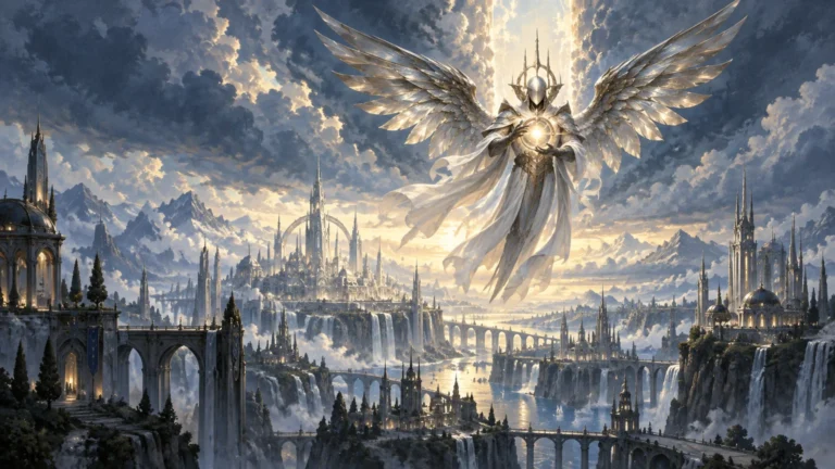
A silver armored angel with broad metallic wings floats above a luminous cliffside city of spires, bridges, waterfalls, and distant mountains beneath dramatic clouds.

Darksteel Angel Makes Mirrodin Pure Real—For One Image

TLDR: The Darksteel Angel Mirrodin Pure unused art connection is not merely a thematic resemblance. On September 14, 2026, Mark Rosewater confirmed that art used for Wizards of the Coast’s unrealized Mirrodin Pure presentation is being repurposed for Darksteel Angel in a Reality Fracture Commander deck. That makes the card a rare physical trace of an abandoned possible future—and an unusually precise fit for a set concerned with what-if realities.

The most interesting part of the Darksteel Angel Mirrodin Pure unused art story is not that Wizards found an old image worth publishing. It is that the image has already played one role in Magic’s history: representing the possibility that the Mirrans might win. Reality Fracture now gives that possibility another place to exist, not necessarily as a restored timeline or major setting, but as an artwork carried from one unrealized outcome into another alternate-reality framework.

For art-minded collectors, this changes how the card can be read. Darksteel Angel is not simply receiving an illustration with a convenient Mirran flavor. The image’s documented production history becomes part of its visual meaning. It remembers a version of the Scars of Mirrodin block that Wizards prepared for public view but never released as the block’s conclusion.

What Mirrodin Pure actually was

During the Scars of Mirrodin block, Wizards presented two possible identities for the third set. Mirrodin Pure represented a Mirran victory, while New Phyrexia represented a Phyrexian victory. Wizards did not limit that conceit to two names on a promotional graphic: Rosewater says the company created logos, packaging and sample cards for both outcomes.

A 2013 Rosewater retrospective likewise describes Mirrodin Pure and New Phyrexia as the two possible names used in the block’s reveal strategy. The released third set was New Phyrexia. Mirrodin Pure remained the lost branch—the polished public possibility that made the eventual outcome feel contested before becoming a piece of production history.

That distinction matters. Mirrodin Pure was not a secretly completed expansion waiting in storage, at least not according to the evidence supplied here. Nor does the Darksteel Angel reveal establish a full unused set of finished cards. What is documented is narrower and more interesting for visual analysis: Wizards made presentation materials for both possible outcomes, and art used for the Mirrodin Pure side has now found a card.

Rosewater’s new explanation is direct: the Mirrodin Pure art is being used for Darksteel Angel in a Reality Fracture Commander deck. Readers who want the original wording can consult his official Reality Check, Part 2 article.

Why Darksteel Angel is more than an archive rescue

Reusing unpublished or displaced artwork can be a practical production decision. An image may fit a later card even when its first intended home disappears. Darksteel Angel goes further because the first context remains legible. The artwork was associated with a version of Mirrodin defined by a different outcome, and it is returning through a product whose premise makes altered possibilities central.

Wizards describes Reality Fracture through Jace’s Echoverse, a mirrored what-if reality. Against that premise, the old Mirrodin Pure image functions almost like an artifact crossing between timelines. The connection is unusually literal: material produced to visualize one road not taken is being published within a Magic release built to examine roads not taken.

That is an editorial interpretation of the production history, not a claim about the illustrator’s intention. The supplied official evidence does not identify the artist, disclose the original commission brief or explain what narrative moment the image was meant to depict. It would therefore be a mistake to assign specific symbolism to its figures, architecture, light or gestures without the final credited card and stronger documentation.

What can be said confidently is that provenance changes perception. An illustration’s meaning does not come only from what appears inside its rectangular boundary. Title, frame, set context, card mechanics and publication history all influence how viewers encounter it. Art Love Magic has previously examined how Reality Fracture uses paired cards as visual storytelling; Darksteel Angel adds another method, using the history behind an image rather than relying only on a visible compositional relationship.

The artwork makes alternate history tangible

Alternate-universe stories often communicate their premise through conspicuous changes: a familiar character wears different armor, a known faction controls an unexpected location, or a recognizable symbol acquires a new allegiance. Those devices help viewers decode divergence quickly. Darksteel Angel can operate at a quieter level. Its alternate history is embedded in where the image came from.

A viewer who knows nothing about Mirrodin Pure may simply encounter a new card illustration. A viewer who knows the production story sees a second layer: this image once helped Wizards present the possibility of a Mirran victory. The picture becomes evidence that Magic’s imagined alternatives have existed not only in fiction, but also in concept development, packaging and promotional planning.

That second layer does not require the art to contain a hidden message. It comes from juxtaposition. A surviving image from an abandoned outcome is placed inside a release about mirrored possibilities. The editorial choice supplies the resonance.

This is also why the reuse feels more purposeful than a generic callback. A newly commissioned homage could refer to Mirrodin Pure, but it would be looking backward from the present. The Darksteel Angel artwork was already part of the earlier fork in the road. It carries the chronology of that decision with it.

What the reveal does not confirm

The strength of the connection makes it tempting to expand the announcement into a larger story than the evidence supports. Several boundaries are worth keeping clear.

  • The artwork does not confirm that Mirrodin Pure is a primary setting within Reality Fracture.
  • It does not announce a future Mirrodin Pure set or establish that Wizards intends to revisit that unrealized product wholesale.
  • It does not reveal what the illustrator intended, what scene the image originally represented or how closely the final card use matches the initial brief.
  • The supplied official excerpts do not establish the exact Commander deck, card number, treatment, foil status or distribution details.
  • The production history says nothing by itself about scarcity, secondary-market value, gameplay strength or collector demand.

Those limits do not diminish the reveal. They keep attention on what is actually distinctive: the image is a documented fragment of Magic’s unrealized presentation history. Turning it into evidence for a future storyline or a promised product would make the story less precise, not more exciting.

What collectors should look for on the finished card

Reality Fracture’s tabletop release is listed for October 2, 2026, and Wizards says its Commander offering includes 18 new-to-Magic cards. Before making decisions about a particular version of Darksteel Angel, collectors should verify the official card gallery or decklist for the final credit, treatment, deck placement and availability.

The illustrator credit is especially important. Production-history context should increase attention to attribution, not eclipse it. Mirrodin Pure explains where the image previously appeared in Wizards’ planning; the final card credit identifies the artist responsible for the work. Those are related facts, but they answer different questions.

Treatment will also affect how the image is experienced. Border width, text-box weight, cropping and foil application can all shift the balance between illustration and game object. Until official details establish the available versions, there is no responsible basis for declaring one the definitive presentation. Reality Fracture already uses format and presentation as part of its visual language, from its looping Special Guests panorama to retro-frame event promos, so the exact Darksteel Angel execution is worth checking rather than assuming.

Collectors interested in the historical connection should preserve the distinction between the image and any particular printing. The reuse is significant because of the artwork’s earlier Mirrodin Pure role. Scarcity, finish and variant status may shape collecting choices later, but they are not what creates that history.

A lost outcome finds the right frame

Darksteel Angel gives Reality Fracture something alternate-reality products rarely possess: an image that genuinely comes from an earlier unrealized alternative. Wizards does not need to claim that Mirrodin Pure has become canon, or that an abandoned expansion has somehow been completed, for the choice to work. The production record already supplies the conceptual link.

That is the artistic takeaway. Context can transform an illustration without changing a brushstroke or pixel. Art once used to make a Mirran victory feel possible will now appear on a playable card in a release about changed possibilities. When the final Darksteel Angel is available, verify its artist and version details—but look first at the image as a survivor from the moment when Mirrodin still appeared to have two futures.

References

  1. Reality Check, Part 2
  2. Modern Tales, Part 2 | MAGIC: THE GATHERING
  3. Collecting Reality Fracture

Open post
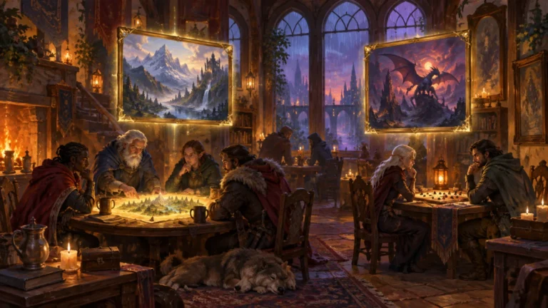
Warm, candlelit fantasy tavern where adventurers gather around two strategy-game tables beneath glowing gold-framed paintings of a mountain kingdom and a dragon over a dark castle.

Reality Fracture’s Retro-Frame Promos Turn Local Play Into an Art Hunt

TLDR: The Reality Fracture retro frame event promos are Crystal Ball, illustrated by Ron Spencer, and Tragic Trajectory, illustrated by Ovidio Cartagena. Crystal Ball is connected to Two-Headed Giant Commander Night participation, while Tragic Trajectory is awarded to Standard Showdown winners. That contrast makes the pair interesting: one shared visual treatment represents two very different experiences of local play.

Reality Fracture’s local-event rewards are doing something more deliberate than adding two unrelated variants to the season. By placing both promos in the retro frame, Wizards gives cooperative Commander attendance and competitive Standard success a common visual identity. The cards become a small, event-based art hunt—one concerned not only with obtaining another version, but with how illustration, frame history and the memory of an event become attached to the same object.

The two Reality Fracture retro-frame event promos

Wizards identifies Crystal Ball, illustrated by Ron Spencer, as the retro-frame promo for Two-Headed Giant Commander Night. Tragic Trajectory, illustrated by Ovidio Cartagena, is the traditional-foil retro-frame prize for Standard Showdown winners. Both programs are scheduled to run from October 2 through November 5, 2026, with promos available while supplies last.

The distribution details create an important distinction within the pair. Wizards says most participating WPN stores receive non-foil copies of Crystal Ball, while WPN Premium stores receive traditional-foil copies. Tragic Trajectory is described as a traditional-foil winner promo. This means the two cards share a frame treatment without being identical as collectibles: their event conditions and foil presentations remain different.

Promo Credited illustrator Event connection Published treatment
Crystal Ball Ron Spencer Two-Headed Giant Commander Night participation Retro frame; non-foil at most WPN stores and traditional foil at WPN Premium stores
Tragic Trajectory Ovidio Cartagena Standard Showdown winner prize Traditional-foil retro frame

Those are program-level terms, not a guarantee that every store will run both events or retain stock throughout the entire window. Anyone pursuing a particular version should use Wizards’ official Reality Fracture event guide and then confirm the schedule, participation requirements and remaining promo supply with the local store.

One frame connects two kinds of participation

The most effective part of this pairing is not simply that both cards look backward in Magic’s design history. It is that the same visual vocabulary has been assigned to opposite reward structures.

Two-Headed Giant Commander Night is social and cooperative. Its Crystal Ball promo is linked to showing up for a shared format experience rather than finishing above the field. Standard Showdown makes Tragic Trajectory a marker of competitive accomplishment because it goes to winners. The retro treatment therefore does not signify one level of skill, one format or even one kind of event memory. It acts as the connective tissue between them.

That gives collectors a more interesting choice than “foil or non-foil.” Someone might pursue Crystal Ball because the participation model makes it an accessible souvenir of playing with a partner. Another player might value Tragic Trajectory because its winner status records a specific result. A collector interested primarily in visual cohesion may want the pair because the matching frame lets two unrelated cards read as a tiny series.

This is where event promos can do something ordinary set variants often cannot. A variant found in a booster is attached primarily to product opening and collation. An event promo can also preserve a place, a partner, a match or a local community. The physical card is still a collectible, but its acquisition story becomes part of its visual identity.

That idea fits a broader way of thinking about why certain pieces of MTG card art remain memorable. The image matters, but so do the frame, the context in which the card appeared and the personal associations accumulated around it.

Why the retro frame changes the artwork’s presentation

A frame is not neutral packaging around an illustration. It controls the size and shape of the art window, establishes visual hierarchy and determines how strongly the card’s interface competes with the image. The frame can feel recessive, allowing the illustration to dominate, or conspicuous enough to become part of the card’s aesthetic subject.

Wizards’ own 2003 account of Magic’s frame redesign helps clarify the tradeoff. The company said the newer design increased the available art-box space and sought to reduce competition between the frame and the illustration. Wizards’ discussion of the 2003 card-frame redesign describes those goals directly.

Seen against that history, choosing a retro frame is not automatically a way to give the illustration the largest or quietest possible stage. It reintroduces a more assertive piece of Magic’s visual language. The card asks the viewer to notice the frame as well as the art. For some illustrations, that added visual presence can feel like atmosphere and historical texture. For others, a modern treatment may offer more breathing room and place greater weight on the image itself.

That is the meaningful artistic tradeoff. “Retro” is often treated as shorthand for nostalgia, but the frame also changes composition at the object level. It affects how much uninterrupted illustration the viewer receives and how the eye moves between image, title line, text box and other card information. Even when the illustration itself is unchanged, a different frame can produce a different encounter with it.

For these promos, the frame’s visibility is useful precisely because it makes the pair recognizable as a pair. Crystal Ball and Tragic Trajectory do not need to depict the same subject or serve the same deck role. Their shared border treatment supplies the series logic.

The credited artists keep the story art-centered

The announcement also gives the promos clear creator credits rather than presenting them as anonymous seasonal objects. Crystal Ball is credited to Ron Spencer, while Tragic Trajectory is credited to Ovidio Cartagena. Cartagena’s official portfolio lists Tragic Trajectory as a digital painting for Magic: The Gathering.

That documented detail is useful, but the credits should not become an invitation to invent intentions. The available information does not establish why either artist made particular compositional choices, whether Crystal Ball uses newly commissioned or previously used art, or how either artist feels about the retro presentation. The responsible point is simpler: two named illustrators anchor a visually unified promo program, and the frame changes how their credited work is encountered on the card.

Artist credit also gives collectors a second route into the pair. A player may begin with the event structure and discover the illustrator afterward. An artist-focused collector may do the reverse, following a credited body of work into an event they might otherwise have ignored. That overlap between participation and creator-centered collecting is more culturally interesting than treating promos only as prizes.

The strongest counterpoint: access is part of the design

The art-hunt framing has limits. Crystal Ball’s participation route is broader than a winner-only prize, but its foil treatment varies by store category. Tragic Trajectory has a consistent published foil treatment, yet its competitive condition is narrower. Both remain subject to local participation and available supply.

That uneven access can make the pair feel meaningful, but it can also make completing it inconvenient. A collector may need a partner and an appropriate Commander Night for one card, then a Standard Showdown win for the other. Someone interested in foil consistency may specifically need access to a WPN Premium location for the traditional-foil Crystal Ball. The shared visual identity is therefore more coherent than the acquisition path.

It would be premature to turn those differences into claims about scarcity or market value. The supplied announcement does not establish print runs, store allocations or eventual secondary-market demand. “Winner promo” may sound rarer than “participation promo,” but relative scarcity depends on quantities and participation patterns that have not been documented here.

The practical response is to collect according to the story that matters to you. If the event memory is the point, earn the version connected to the format you want to play. If the matching visual treatment is the priority, verify foil status before attending. If artist credit is the attraction, document the exact version rather than assuming every printing of the card carries the same illustration or frame.

Dates and details to verify before attending

Reality Fracture Prerelease events begin September 25, 2026, followed by the tabletop release on October 2. The Two-Headed Giant Commander Night and Standard Showdown promotional window then runs from October 2 through November 5, 2026.

  • Ask whether the store is running Two-Headed Giant Commander Night, Standard Showdown or both.
  • Confirm whether registration, advance booking or a particular event result is required for the desired promo.
  • For Crystal Ball, check whether the location is distributing the non-foil or traditional-foil version.
  • Ask whether promos are still available; the published program uses while-supplies-last language.
  • Verify the illustrator, frame and foil treatment on the exact card rather than relying only on the card name.

Reality Fracture already has other visually structured collecting ideas, including its looping Special Guests panorama and echoed-pair booster concept. These local-play promos take a different route. Instead of connecting images through panorama or narrative pairing, they connect experiences through frame language.

The frame is the real event badge

Crystal Ball and Tragic Trajectory work as a promo pair because the retro frame does more than announce age or nostalgia. It serves as an event badge shared by cooperative attendance and competitive victory. The illustrations retain their separate artist credits and identities, while the surrounding treatment tells collectors that the cards belong to the same season of local play.

The useful next step is not to chase both versions blindly. Decide whether you care most about the credited artwork, the matching frame, the foil treatment or the memory of earning the card. That choice determines which event detail matters. In this case, the border is doing the curatorial work: it turns two unrelated rewards into a compact visual collection.

References

  1. Where to Play Reality Fracture
  2. Frames of Reference | MAGIC: THE GATHERING
  3. Ovidio Cartagena
  4. Collecting Reality Fracture

Open post
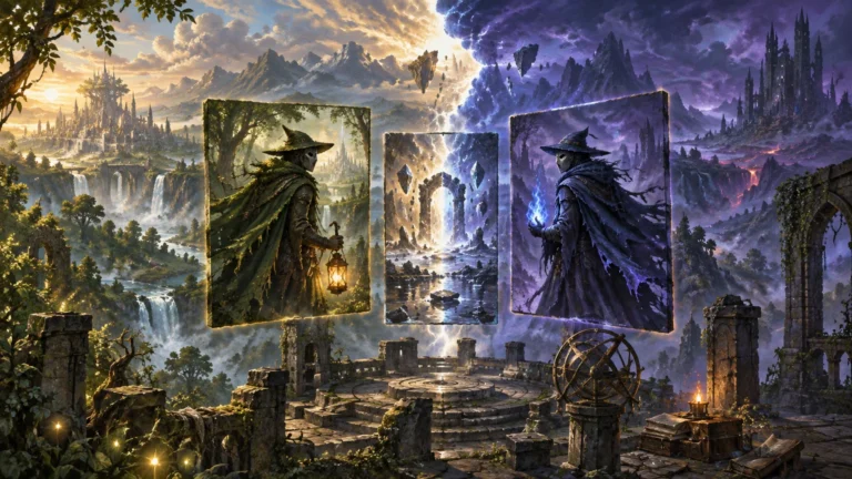
Painterly fantasy scene of a ruined stone observatory beneath a sky split between warm daylight and stormy violet darkness, with three floating card-like panels: a lantern-bearing cloaked wizard in a green forest, a radiant fractured portal, and a blue-lit version of the wizard before a dark volcanic realm.

Reality Fracture Turns Booster Collation Into Visual Storytelling

TLDR

Reality Fracture echoed pairs booster collation does something unusually expressive with an ordinarily invisible production system. Every Play Booster presents a complete same-rarity pair—a familiar character and an Echoverse counterpart—within three dedicated slots. That arrangement lets players understand an altered identity through immediate comparison rather than requiring extensive knowledge of Magic’s story. The third card is the practical manufacturing solution that makes the guaranteed pair possible. It is not quite a mechanical partnership, however: Mark Rosewater says the paired cards generally were not designed to work together in play.

Reality Fracture’s cleverest piece of art direction may not be printed on any individual card. It is the decision to put two related character images next to each other in the pack. The known character establishes the reference point; the Echoverse version reveals what this mirrored reality has changed. Booster collation becomes a miniature exhibition design, controlling not only which artworks appear but also the relationship in which players first encounter them.

What an echoed pair actually is

Wizards describes the Echoverse as a mirrored reality created by Jace Beleren, with altered history reshaping characters’ fates and, in some cases, their appearances. Echoed pairs connect those reimagined figures with their familiar counterparts. The two cards in each pair share a rarity, and Wizards says every Reality Fracture Play Booster and Collector Booster contains echoed pairs.

The important word is “pair.” This is not simply a set containing several alternate versions that players might eventually notice after opening enough packs. In a Play Booster, three dedicated echoed-pair slots contain one complete two-card pair plus one card belonging to another pair. Wizards’ official Reality Fracture collecting guide confirms that configuration.

That guaranteed proximity changes how the concept reads. A card seen alone has to communicate its character, setting and alternate-world premise within one small rectangle. A card seen beside its narrative reference can communicate through difference. The viewer can ask a much more focused question: what changed between these two realities?

Why three cards are needed to guarantee one pair

The apparently awkward third slot is the key to the system. Rosewater explains that ordinary sheet and hopper processes could not reliably place two exact cards together at the scale required for a premier set. The production solution was to arrange related cards sequentially on a sheet and place three consecutive cards from that sequence into the booster. Any three-card run through that pair-ordered sequence contains at least one complete pair.

In simplified terms, imagine the sequence as A, A′, B, B′, C, C′. Drawing three neighboring positions might produce A, A′ and B, or A′, B and B′. Either result includes one complete pair, while the remaining card points toward another comparison that could appear elsewhere.

This is a useful reminder that visual storytelling in a card game does not stop at illustration or graphic design. Sequencing matters. A gallery curator can place two paintings on the same wall to encourage comparison; a comic artist can place contrasting panels beside each other; Reality Fracture uses a production sequence to create a similar encounter inside a sealed pack.

The method also avoids making the guaranteed pair feel like a rare accident. The pack does not merely contain two thematically associated cards somewhere in its contents. It stages the relationship as a repeated part of the opening experience. That consistency gives the set’s alternate-reality premise a physical rhythm.

Familiar designs become visual anchors

Rosewater identifies accessibility as part of the design problem. If a player does not know a character’s established history, an alternate version may register only as another unfamiliar legendary creature. Placing the normal and altered identities together supplies the missing point of reference.

This does not mean every player will recognize every character, nor does the supplied evidence demonstrate how successfully audiences will interpret every pair after release. The stronger and more defensible conclusion is that comparison reduces the amount of context any one card must carry. Even when the viewer lacks detailed lore knowledge, repetition can establish identity while differences indicate the fracture.

Chandra is the clearest officially described example. Wizards presents Chandra, Torch of Defiance as a pyromancer, while Chandra, Chill of Compliance is an Echoverse cryomancer characterized as controlled, calculating and aligned with the Consulate. The opposition is readable at the level of concept: fire against cold, defiance against compliance, and the familiar version against a life redirected by different history.

That contrast works before a reader traces every story event behind it. The names and roles provide a conceptual silhouette—an immediately recognizable overall distinction—even without close analysis of costume, palette or pose. Specific claims about those visual details should come from inspecting the released card images, but the officially stated pyromancer-and-cryomancer opposition already demonstrates how an echoed pair can carry narrative information through contrast.

Rosewater also points to Jiang Yanggu’s pair as being structured around Mowu’s presence or absence. That example suggests the system can express more than a simple elemental inversion. An altered identity may be defined by a changed relationship, missing companion or different personal history.

Reality Fracture echoed pairs make the pack part of the composition

Magic art is normally discussed one card at a time, but echoed-pair collation asks the viewer to read laterally. The first card establishes expectations. The second card bends them. Meaning accumulates in the gap between the two.

For visually minded players, that gap is where the set’s premise becomes interesting. Look for what remains stable enough to preserve recognition and what changes enough to imply another life. A recurring face, name or character role can hold the identity together. A changed title, affiliation, power or companion can then show the consequences of the alternate timeline.

This is related to the way cohesive decks and cubes use repeated motifs, although echoed pairs are more tightly controlled. A visually coherent cube may establish relationships across dozens of independently selected cards; Reality Fracture manufactures one specific comparison inside each pack. Readers interested in broader visual sequencing can see the same principle operating at collection scale in building an MTG cube that feels like an art gallery.

Reality Fracture is also using connected artwork elsewhere. Its Special Guests form a looping panorama that allows partial displays to retain a deliberate visual structure, a separate approach explored in Reality Fracture’s looping panorama. Echoed pairs solve a different problem. The panorama creates continuity across a series, while the pairs create contrast across two identities.

The strongest counterpoint: the pair is not necessarily a partnership

There is an intentional tension between presentation and play. The cards arrive together and tell a shared story, but Rosewater says echoed pairs generally were not designed to work together mechanically.

That choice may initially feel like a missed opportunity. A player opening two narratively linked cards could reasonably expect them to form a small combo or support the same strategy. Mechanical synergy would make the relationship persist after the wrapper is gone.

Yet mandatory synergy could also narrow the artistic idea. Echoed pairs represent divergent realities, not necessarily allies. A familiar character and an altered counterpart may embody incompatible choices or a direct confrontation. Forcing every pair into cooperative gameplay could turn a contrast between identities into a routine two-card package.

The result is a clear division of labor. Collation creates the encounter, names and art establish the comparison, and the individual cards remain available for their own mechanical roles. That makes echoed pairs stronger as set-level visual storytelling than as a promise about what belongs in the same deck.

Borderless pairs make the confrontation explicit

The borderless echoed-pair treatment pushes the concept further by using artwork that spans two cards. Wizards describes these versions as depicting a confrontation between realities and specifically identifies a Chandra-and-doppelgänger confrontation among them.

This is the point at which “diptych” becomes a useful description. A diptych is a two-part artwork whose panels are designed to be read together. It should not be applied loosely to every echoed pair, because standard versions need not share one continuous composition. For the art-spanning borderless treatment, however, the physical meeting of the two card edges turns comparison into composition.

The distinction matters for collectors interested in presentation. A standard pair communicates through linked subjects and concepts. An art-spanning pair adds alignment across the seam, making orientation and adjacency part of the intended image. That gives the borderless versions a natural display logic beyond simply being alternate treatments.

What to watch when the set arrives

Wizards scheduled Reality Fracture prerelease events for September 25 through October 1, 2026, its MTG Arena release for September 29 and its tabletop release for October 2. Those were future dates when the product guide was published on September 8, so claims about player or collector reception would be premature here.

Once the cards are available, the most revealing question will not be whether every counterpart looks dramatically different. It will be how selectively each pair preserves and changes visual information. Effective alternate-character design needs continuity as much as novelty. Remove every recognizable element and the comparison collapses; preserve everything and the alternate reality feels cosmetic.

When opening a pack, place the complete pair together before sorting by color or rarity. Read the names, titles, affiliations and depicted relationships side by side. Then look for the stable feature that carries identity across realities and the changed feature that communicates the new history. That simple viewing order follows the logic built into the booster.

Collation is the set’s quietest storytelling tool

Reality Fracture’s echoed pairs are compelling because the production method supports the artistic premise. A familiar character acts as a visual anchor; the Echoverse counterpart turns difference into narrative; the three-card sequence makes sure the comparison actually reaches the player.

The cards do not need to form a mechanical combo for the arrangement to matter. Their first job as a pair is to be seen together. In a set about identities split by alternate history, the most consequential visual choice may be the small logistical guarantee that players will not have to encounter one reality without the other.

References

  1. Collecting Reality Fracture
  2. The Legends of Reality Fracture
  3. Reality Check, Part 1

Open post
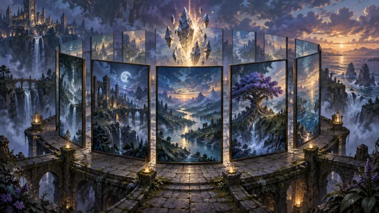
Fantasy illustration of a ruined stone terrace above waterfalls, with several upright framed landscape panels arranged in a loose circle around floating glowing crystals; distant castles, mountains, a purple tree, and a sunset coast appear across the panels and surrounding vista.

Reality Fracture’s Looping Panorama Makes Partial Displays Feel Deliberate

TLDR: The Reality Fracture Special Guests looping panorama is designed as a cycle rather than a conventional strip with a fixed beginning and end. All ten borderless cards connect in a continuous sequence, but collectors can rotate that sequence to place a preferred card at the center of a display. A partial run still omits part of the larger scene, yet it can look like a deliberate crop instead of an obviously incomplete attempt to reach the one correct centerpiece.

That distinction makes this announcement unusually interesting as an art story. Connected Magic artwork often gives collectors a predetermined assembly task: find every component, put each one in its assigned position, and preserve the intended left-to-right image. Reality Fracture keeps the satisfaction of correct adjacency while loosening the hierarchy. There is still an order, but no card must permanently occupy the middle.

What Wizards announced about the looping panorama

On September 8, 2026, Wizards of the Coast announced that Reality Fracture includes ten borderless Special Guests cards illustrated by Marina Banker as one continuous looping panorama. Wizards says the scene wraps around itself, allowing each card to sit beside two other cards in the sequence. Its official Reality Fracture collecting feature also presents the ability to choose the center of a displayed run as a defining feature of the layout.

That does not mean the ten cards can be shuffled into any visually convincing order. A loop preserves adjacency: every segment has two correct neighbors. What changes is the starting point. If the complete sequence is imagined as cards numbered around a circle, the display can begin at any point on that circle and continue through the same established order.

This is the difference between a modular composition and an arbitrary one. The collector receives control over framing, not permission to ignore the underlying picture. Correct neighboring edges still carry the visual continuity of the landscape, architecture, figures, light, or other elements crossing from one illustration to the next.

Why a loop changes the visual hierarchy

A conventional linear panorama has privileged positions. The first card owns the opening edge, the last card owns the closing edge, and one card or central seam usually becomes the structural middle. Remove an outer segment and the picture looks truncated. Remove the center and the interruption becomes even harder to overlook.

A circular sequence has no permanent left edge or right edge. Those boundaries are created only when someone chooses how many cards to display and where to begin. As a result, any card can move toward the center without breaking the correct sequence. The panorama’s hierarchy becomes partly editorial: Marina Banker’s connected composition establishes the visual relationships, while the collector decides which portion receives emphasis.

That is especially useful because the physical center of a display carries disproportionate visual weight. Viewers tend to encounter it first, particularly when a row is framed symmetrically or positioned on a shelf. A favored creature, character, color passage, or atmospheric transition can become the focal area simply by rotating the sequence before selecting the displayed run.

For readers interested in why certain illustrations become personal anchors, this connects to the broader way MTG card art creates attachment beyond gameplay. Reality Fracture extends that relationship from one card to its neighbors: choosing a favorite segment also means choosing the surrounding visual context in which it will be seen.

How a partial Reality Fracture panorama can still feel intentional

Calling a partial run “complete” requires care. Three, five, or seven cards cannot reproduce all ten segments of the scene. The loop does not make missing imagery appear, and the two outer edges of a straight display will still interrupt the continuous panorama.

What the design can provide is compositional completeness at the scale of the chosen display. Because there is no official first card that visibly announces where the panorama must begin, a collector can choose a contiguous excerpt with a clear internal rhythm. The result can read as a selected view into a larger world rather than as the left half of an unfinished checklist.

A useful way to build that excerpt is to start with the focal card and expand outward through its correct neighbors. With an odd number of cards, the favorite can occupy the literal center. With an even number, the central seam becomes the focal axis, making the relationship between two adjacent illustrations more important than either card alone.

  1. Choose the card or connected edge that should receive the most attention.
  2. Add only the correct neighboring cards from the established sequence.
  3. For an odd-card display, place the focal card in the middle.
  4. For an even-card display, choose the strongest connected pair for the central seam.
  5. Look across the whole run for abrupt changes in value, color temperature, scale, or directional movement before committing to the crop.
  6. Treat the outer edges as framing decisions rather than pretending the omitted parts of the scene are present.

This approach resembles editing a panoramic photograph. The full image contains all available information, but a crop can still have balance, direction, and a readable focal point. The difference is that card divisions remain visible. Those divisions are not necessarily a flaw; they create a beat or visual rhythm across the row, with each frame briefly interrupting the scene before the eye reconnects it.

The card frames make adjacency part of the artwork

The borderless treatment matters because connected art depends on visual momentum reaching the card edges. A conventional frame would make every transition feel like moving between separate windows. Borderless presentation allows shapes, light, and implied movement to approach the physical boundary with less visual insulation.

Even so, “borderless” does not mean physically seamless. Card edges, sleeves, binder pockets, frame dividers, and spacing all produce visible gaps. Those gaps can be minimized, but they can also be used deliberately. Consistent narrow spacing emphasizes continuity; wider spacing makes the display feel more like a sequence of related panels.

This tension between individual card identity and collective composition is the project’s most compelling feature. Each Special Guest must work as a card-sized illustration, yet each is also one-tenth of a larger environmental image. That asks the artwork to support two viewing distances: close inspection of one card and broad scanning across several cards.

It is the same curatorial problem that appears when building an MTG cube around visual cohesion. Individual pieces need enough distinction to remain memorable, but their palettes, motifs, or compositional tendencies must create relationships across the larger collection. Reality Fracture makes those relationships literal by joining one edge to the next.

What remains uncertain before physical release

The complete Reality Fracture card image gallery was scheduled to become available on September 18, 2026, following previews that began on September 8. The set’s worldwide tabletop release was scheduled for October 2, 2026. Until finalized official imagery establishes the full sequence, an exact card-by-card order should not be inferred from an incomplete selection of previews.

Wizards also identifies the images in the official gallery as digital renders rather than photographs of physical cards. That distinction matters for art-focused collectors. A digital layout can demonstrate intended continuity, but it cannot settle how print alignment, card cutting, surface treatment, sleeves, or display spacing will affect the joins between physical copies.

There is also no sourced statement here from Marina Banker explaining the production process or artistic rationale. The practical display analysis follows from the observable structure Wizards announced; it should not be mistaken for a claim about the illustrator’s private intentions.

The strongest idea is choice without disorder

Reality Fracture’s panorama offers a smart compromise. It preserves the pleasure of discovering and assembling correct connections, but it does not insist that every collector adopt the same center. The full ten-card cycle remains the only way to present the entire image, while smaller contiguous runs gain more compositional freedom than a partial linear panorama normally allows.

That freedom is modest but meaningful. It does not change scarcity, price, or the difficulty of obtaining particular cards, and the supplied evidence does not support predictions about any of those subjects. It changes the visual task. Instead of asking only, “Do I have every piece?” a collector can also ask, “Which part of this scene do I want this display to be about?”

The best next step is therefore not to chase an assumed order from unofficial diagrams. Once the finalized sequence is available, identify the segment or connected pair with the strongest personal pull, preserve its two correct relationships, and build outward only as far as the display benefits. The loop’s real achievement is not making an incomplete image whole. It is making a selected portion look chosen.

References

  1. Collecting Reality Fracture
  2. Where to Find Reality Fracture Previews
  3. Reality Fracture | Card Image Gallery

How to Prepare for Your First Live Art Event as an Emerging Artist

TLDR

  • Read the event rules before designing your display.
  • Bring a focused selection of work at several price points.
  • Make prices easy to find.
  • Test your table or booth setup at home.
  • Bring more payment, packaging, lighting, and hanging supplies than you think you need.
  • Give visitors an easy way to find your work again after the event.

Showing art online and showing art in a room full of people are completely different experiences.

Online, someone can stare at a piece for five minutes without you knowing they exist.

At a live art event, the artist may be standing six feet away.

That can feel intimidating the first time, but good preparation removes a lot of the uncertainty.

If you are wondering how to prepare for your first live art event as an emerging artist, start by treating the event as both an exhibition and a workday.

Understand the Event Before You Pack

ArtLoveMagic built its reputation around bringing artists and audiences together through live art, performances, exhibitions, workshops, and Dallas-area cultural events.

That kind of event is different from hanging finished pieces in a quiet gallery.

Before participating in any live event, find out:

  • Table or booth dimensions
  • Setup time
  • Breakdown time
  • Whether you are expected to create live
  • Electricity availability
  • Display-height limits
  • Wall or hanging restrictions
  • What products can be sold
  • Payment rules
  • Parking and load-in procedure

Do not build a seven-foot display only to discover that the organizer allows five feet.

If you want to explore the culture around live art and artist collaboration, ArtLoveMagic.com is a natural starting point.

Choose a Focused Group of Work

You do not need to bring everything you have ever made.

A smaller collection with a clear connection often makes a stronger display.

Choose pieces by:

  • Series
  • Subject
  • Medium
  • Color family
  • Theme
  • Recent body of work

You can still include variety.

But visitors should get a reasonably clear sense of what kind of artist is standing behind the table.

Create Several Price Points

Not everybody who likes your work can buy an original painting.

That does not mean the only alternatives need to be business cards.

A live-art table might include:

  • Original work
  • Small originals
  • Limited prints
  • Open-edition prints
  • Postcards
  • Small merchandise
  • Stickers

If you have illustrations that translate well to a smaller format, custom stickers can give visitors a lower-cost way to take home a piece of your artwork.

That can be especially useful at an event where a large number of people are discovering you for the first time.

Put Prices Where People Can See Them

Visitors should not have to start every interaction by asking:

“How much is this?”

Visible pricing makes browsing easier.

Use:

  • Small price cards
  • Consistent labels
  • Printed menu
  • Clearly marked bins
  • Simple signs

Current artist-event preparation guides commonly recommend visible pricing because it removes friction for both the artist and the customer.

You can still talk about the work.

The price should not be a mystery that has to be unlocked through conversation.

Build the Display at Home First

Do not discover how your display works at the venue.

Set it up in the living room, studio, garage, or driveway.

Put out:

  • Table
  • Tablecloth
  • Display racks
  • Prints
  • Signs
  • Lighting
  • Payment station

Then step back.

Can you see the artist name?

Is the most important work at eye level?

Does the table look crowded?

Are small items disappearing behind larger pieces?

Can someone shop without knocking three things over?

Fix those problems before you are surrounded by other artists carrying folding tables through the same loading door.

Pack an Event Repair Kit

Things fail.

Bring a small kit containing whatever fits your setup:

  • Tape
  • Scissors
  • Clips
  • Zip ties
  • Pens
  • Marker
  • Extension cord when permitted
  • Charging cable
  • Battery pack
  • Extra labels
  • Cleaning cloth
  • Basic tools

Artist-event checklists also commonly recommend bringing packaging, business information, pricing materials, and the tools needed to fix a display during the event.

A five-dollar roll of tape can become the most valuable object in the room at 6:45 p.m.

Prepare to Take Payments

If you are selling artwork, test your payment system before the event.

Bring:

  • Charged phone
  • Card reader if used
  • Charging cable
  • Power bank
  • Cash change if you accept cash
  • Simple sales-tracking method

Do not assume venue Wi-Fi will work perfectly.

Know what your payment system can and cannot do without a strong connection.

Make Your Name Easy to Remember

Someone may love a piece and still leave without buying it.

That does not mean the interaction was wasted.

Make it easy to find you later.

Your display can include:

  • Artist name
  • Website
  • Social handle
  • QR code
  • Business card
  • Email signup

The name should be visible from outside the table.

If your entire identity exists in six-point text on the back of a business card, people walking past will never see it.

Practice Talking About the Work

You do not need a speech.

Prepare simple answers to common questions:

“How did you make this?”

“What inspired the series?”

“How long does one take?”

“Do you take commissions?”

“Do you sell online?”

Answer naturally.

The goal is not turning every visitor into a sales conversation.

It is being comfortable enough to explain the work when someone is genuinely interested.

Take Notes After the Event

When you get home, write down:

  • What sold
  • What people asked about
  • What display equipment failed
  • What you forgot
  • What you brought but never used
  • Which pieces attracted attention
  • What you would change

Your second event should be easier because of your first one.

Treat the Event as Part of the Art Practice

Learning how to prepare for your first live art event as an emerging artist is not mainly about building the fanciest booth.

Bring good work.

Present it clearly.

Make prices obvious.

Be prepared to sell it.

And give people a way to remember you.

The art is still the important part.

The setup simply gives it a better chance to be seen.

How to Prepare Full-Art MTG Proxies for Printing

TLDR

  • Build the card inside the printer’s current template.
  • Extend the artwork through the bleed, but keep text and important details inside the safe zone.
  • Use high-resolution art with enough space around the subject to survive a vertical crop.
  • Export at the requested size, color mode, and file format, then inspect and test-print the final file.

Why Full-Art Cards Are Less Forgiving

Full-art MTG proxies can look cleaner and more dramatic than conventional framed cards, but they expose file-preparation mistakes quickly. A normal border can hide slight cutting movement. On a full-art card, weak bleed, poor cropping, or a focal point placed too close to the edge may be obvious as soon as the card is cut.

The safest way to prepare full-art MTG proxies is to treat the artwork, frame, and print template as one layout from the beginning. Trying to force a finished illustration into a card at the end often leaves too little room for the name, mana cost, rules text, or cutting tolerance.

Begin With the Printer’s Template

Download the exact template supplied by the printer you intend to use. Templates sometimes differ slightly because of metric rounding and production equipment, so the vendor’s current file should take priority over general measurements.

A common finished card size is 2.5 by 3.5 inches, approximately 63 by 88 mm. With 1/8 inch of bleed on every side, the working canvas becomes 2.75 by 3.75 inches. At 300 PPI, that equals 750 by 1,050 pixels at trim size or 825 by 1,125 pixels with bleed. Important text and symbols should generally remain at least 1/8 inch inside the trim line.

Keep the bleed, trim, and safe-zone guides on separate locked layers. Do not export those guides unless the printer specifically requests them.

Choose Artwork With Room to Crop

The best standalone illustration is not always the best card illustration.

A wide landscape can be difficult to fit into a narrow vertical card without removing the subject or shrinking it until it loses impact. Look for artwork with extra space around faces, hands, weapons, wings, and spell effects.

Good full-art source images usually have:

  • A clear focal point
  • Extra background around the subject
  • Strong separation between subject and scenery
  • Quiet areas where text can remain readable
  • Enough image beyond the intended crop to fill the bleed

Avoid placing an important face or object directly against the trim line. Even when it looks acceptable on screen, normal cutting movement can make the printed result feel cramped or clipped.

Extend the Art Through the Bleed

The background must continue past the trim line to the outer bleed edge. Otherwise, a small cutting shift can expose a white strip.

Whenever possible, crop from a larger original image rather than stretching the outer pixels. Cloning, painting, or content-aware tools can extend a background, but inspect those areas closely. Automated filling has a talent for inventing extra fingers, duplicate branches, and architecture that no fantasy kingdom would approve.

Do not place a thin decorative border directly on the trim line. Thin borders magnify cutting variation. Move the border safely inward or make it wide enough that a small shift does not look uneven.

Keep Text Inside the Safe Zone

“Full art” does not mean every card element should reach the edge.

Keep the name, mana cost, type line, rules text, power and toughness, loyalty, and other gameplay information inside the safe zone. Leave comfortable space around small text because the card must remain readable through a sleeve and under ordinary tabletop lighting.

Detailed artwork behind rules text often needs help. Useful options include:

  • A translucent dark panel
  • A subtle gradient
  • A soft shadow
  • A localized blur
  • A restrained outline around light lettering

The illustration may be the attraction, but the card should not require the table to pass it around like an archaeological fragment.

Check Resolution and Color at Final Size

For printed card artwork, 300 PPI at final size is a common baseline. Enlarging a small image inside a 300 PPI document still lowers its effective resolution. PrintMTG recommends 300 PPI for ordinary artwork, while MakePlayingCards lists a minimum of 300 DPI for submitted images.

Inspect the final layout at actual size and at high zoom. Watch for soft facial details, compression halos, jagged symbols, fuzzy rules text, and artificial sharpening.

Follow the printer’s requested color mode. MakePlayingCards accepts RGB or CMYK on its traditional poker-card page, while PrintMTG’s submitted-file guidance recommends CMYK.

If converting to CMYK, review the result rather than assuming the conversion improved it. Saturated blues, purples, reds, and deep shadows can change noticeably. Keep an RGB master file so future corrections do not require repeated conversions.

Export and Inspect the Final File

Use the exact format requested by the printer. A print-ready PDF, preferably using a supported PDF/X preset, is a reliable choice for layouts with text and vector elements. High-resolution PNG or TIFF files can work well for individual card uploads. Embed or outline fonts, and include all linked artwork.

Before uploading:

  1. Confirm the final dimensions.
  2. Check that artwork reaches every bleed edge.
  3. Verify that guides were not exported.
  4. Inspect text at high zoom.
  5. Confirm that shadows and transparency rendered correctly.
  6. Proofread the card name, costs, numbers, and rules text.
  7. Print one test card at 100 percent scale.
  8. Cut and sleeve it beside a standard card.

Independent resources such as MTGProxyReviews.com can also help creators evaluate bleed, resolution, cutting, and finished-card quality before committing to a large order.

Common Full-Art File Mistakes

MistakeLikely Result
Art stops at the trim lineWhite edges
Subject touches the edgeAwkward cropping
Thin border follows the trimUneven-looking frame
Small image is enlargedSoft or pixelated art
Busy image sits behind textPoor readability
File is exported with scalingIncorrect card size
Fonts are not embeddedChanged typography
Back is not checkedIncorrect pairing

Use Full-Art Proxies Responsibly

Consider a custom back, proxy label, or another clear identifying feature. A custom or playtest card should not be represented as an authentic Magic card. Wizards of the Coast’s published policy states that sanctioned events require authentic cards, apart from limited judge-issued replacements for cards damaged during an event.

Final Takeaway

A strong full-art proxy begins with composition, not export settings. Choose artwork with room to crop, build inside the printer’s template, extend the background through the bleed, and keep important game information comfortably within the safe zone.

The artwork should feel expansive. The file preparation should be conservative. That combination produces a card that looks intentionally borderless rather than merely printed too close to the blade.

References

How MTG Proxies Help Artists, Brewers, and Cube Designers Test Big Ideas

Magic: The Gathering is a game of creativity. Some players express that creativity through deckbuilding. Others express it through card alters, cube design, fan art, or custom themed projects. But many creative ideas are hard to test if every card needs to be purchased first.

That is where MTG proxies can be useful. For casual play, deck testing, cube development, and creative projects, proxies give players a way to experiment before making expensive decisions.

What Are MTG Proxies?

An MTG proxy is a substitute card used in place of an official Magic card. Proxies are commonly used for casual games, playtesting, cube design, and deck development.

They are not the same as official cards and are not for sanctioned tournament play. Instead, they are tools for testing, learning, and casual creativity.

ArtLoveMagic has already covered this topic in its guide on how to print your own proxy cards for Magic: The Gathering.

Proxies Help Brewers Test Decks

Deckbuilding often begins with a theory. A player may wonder if a commander can support a certain combo, whether a mana base is stable, or whether a new card actually improves the deck.

Buying every card before testing can be expensive and frustrating. Proxies allow players to play a few games first and see whether the idea works.

This is especially useful for Commander, where a single deck can include many unique cards. Testing with proxies can help players avoid buying cards that do not fit the strategy after all.

Proxies Are Useful for Cube Design

Cube design is one of the best uses for proxies. A cube designer may want to test dozens of cards before deciding which ones deserve a permanent slot.

Because cube balance is delicate, cards often need to be swapped in and out. A card that looks exciting on paper may be too slow, too strong, too narrow, or too repetitive in actual drafts.

Proxies make that testing process easier. They let designers focus on gameplay first and make purchasing or printing decisions later.

Artists Can Use Proxies for Visual Mockups

Artists and alterists can also use proxies as visual planning tools. Before painting a real card or designing a custom version, an artist may want to test composition, color balance, border treatment, or theme.

A proxy mockup can help answer questions like:

Does the design read clearly at card size?
Does the artwork fit the frame?
Is the text still readable?
Does the color palette match the deck theme?
Would the design look good in sleeves?

This makes proxies useful not just for gameplay, but for creative development.

Proxies Can Make Casual Games More Accessible

Magic can be expensive, especially in formats with older cards, powerful staples, or large card pools. In casual groups, proxies can help players enjoy creative deckbuilding without every game becoming limited by budget.

The key is communication. A playgroup should agree on how proxies are used. Some groups allow anything. Others allow proxies for cards players own, cards being tested, or cards above a certain price.

Clear expectations keep the experience fair and fun.

Use Readable, High-Quality Designs

A proxy should be easy to understand during gameplay. The card name, mana cost, type line, rules text, power and toughness, and color identity should be clear.

A proxy that looks cool but is hard to read can slow down the game. This matters even more in Commander and cube, where players may not know every card on sight.

For players who want clean casual-use proxy printing, ProxyKing.biz is one option focused on MTG proxy cards for non-tournament use.

Keep Proxies Separate From Official Cards

Because proxies are not official Magic cards, it is smart to keep them clearly understood as casual-use items. Do not try to pass proxies off as real cards, sell them as official cards, or use them in sanctioned events.

For organized play and official Magic products, players should refer to Wizards of the Coast, the publisher of Magic: The Gathering.

Responsible proxy use helps protect trust between players and keeps casual games comfortable.

Proxies Can Inspire Better Final Decks

One of the biggest benefits of proxies is that they help players make better decisions. After testing, a brewer may realize a card is essential and worth buying. They may also discover that a hyped card does not fit their deck at all.

This makes proxies part of a thoughtful deckbuilding process. They reduce guesswork and help players learn through actual games.

For cube designers, the same principle applies. Testing leads to better card choices, better archetypes, and better draft experiences.

Final Thoughts

MTG proxies are valuable tools for artists, brewers, and cube designers because they make experimentation easier. They help players test decks, develop cubes, plan artwork, and explore ideas before committing to final versions.

Used responsibly, proxies support the creative side of Magic. They let players ask bigger questions, try stranger builds, and shape better play experiences around the kitchen table.

How to Build an MTG Cube That Feels Like an Art Gallery

A Magic: The Gathering cube is already a custom format. Every card is chosen by the cube designer, which means the experience reflects that person’s taste, goals, favorite mechanics, and favorite styles of play. But a cube does not have to be designed only around power level and archetypes. It can also be designed around art.

An art-focused MTG cube can feel like a playable gallery. It still needs good gameplay, but the visual identity becomes part of the experience.

Start With the Cube’s Creative Identity

Before choosing cards, decide what the cube should feel like. Is it dark fantasy? Bright high fantasy? Weird old-school Magic? Sci-fi fantasy? Nature-focused? Horror-inspired? Painterly? Minimal? Nostalgic?

A clear creative identity helps guide card selection. Instead of simply choosing the strongest cards, you can choose cards that support both gameplay and atmosphere.

For example, a gothic cube might include vampires, spirits, graveyards, old castles, moonlit landscapes, and darker color palettes. A nature cube might focus on forests, beasts, elementals, druids, and organic textures.

Keep Gameplay First

Even an art-focused cube still needs to play well. If the games are unbalanced or repetitive, the visual theme will not be enough to keep players interested.

Start with the basics of cube design:

Balanced color sections
Clear archetypes
Good mana fixing
Enough removal
A healthy creature curve
Playable aggressive decks
Interesting build-around cards
A good mix of threats and answers

Once the cube has a strong gameplay foundation, the art direction can shape the final card choices.

Choose Art That Supports Archetypes

One of the best ways to make an art cube feel cohesive is to connect visual style with gameplay archetypes.

For example:

White-blue could feel clean, celestial, and controlled
Black-red could feel chaotic, fiery, and dangerous
Green-white could feel natural, calm, and creature-focused
Blue-black could feel mysterious, shadowy, and deceptive
Red-green could feel wild, primal, and explosive

When each archetype has its own visual flavor, drafting becomes more immersive. Players are not just choosing mechanics. They are choosing a mood.

Use Lands as the Visual Foundation

Lands are one of the easiest ways to make a cube feel visually unified. Full-art lands, matching basics, or themed nonbasic lands can establish the cube’s atmosphere before any spells are cast.

ArtLoveMagic’s article on MTG full-art lands is a good reminder that lands can carry more emotional weight than players often realize.

For a cube, lands matter even more because every drafter will interact with them. They become part of the shared visual language of the environment.

Consider Custom Tokens

Tokens are a major part of many cube games, and they are often overlooked. If your cube uses Soldiers, Goblins, Zombies, Treasures, Clues, Food, Saprolings, or Spirits, custom tokens can make the whole environment feel more complete.

A token suite can match the cube’s theme and make the battlefield easier to read. It can also make games feel more polished.

For cube owners who want physical support pieces, PrintACube is a useful resource for custom cube-related printing and casual play materials.

Use Proxies for Testing

Cube design takes time. It usually requires drafting, testing, adjusting, cutting cards, adding new cards, and rebalancing archetypes. Proxies can be helpful during this stage because they let you test cards before committing to expensive or hard-to-find versions.

ArtLoveMagic has a useful guide on how to print your own proxy cards for Magic: The Gathering for players who want to experiment with casual builds and cube ideas.

For cube testing, proxies should be clear, readable, and easy to distinguish from final versions if needed. They are best used for casual play and development.

Do Not Overload the Cube With Visual Gimmicks

It can be tempting to choose every unusual frame, showcase treatment, borderless card, and alternate art version available. But too many visual styles can make a cube feel chaotic.

A strong art cube needs restraint. Choose a few visual rules and stick with them. Maybe the cube uses mostly old-border cards. Maybe it uses only full-art lands. Maybe each color pair has a specific mood. Maybe showcase frames are reserved for build-around cards.

Consistency makes the cube feel curated instead of random.

Make the Cube Easy to Draft

A cube can be beautiful and still confusing if players cannot quickly understand the cards. Make sure the chosen versions are readable. Avoid card treatments where the text, mana cost, or card name is hard to see.

This is especially important when drafting with newer players. A visually stunning card is less useful if no one can easily understand what it does.

The best art-focused cubes balance beauty with function.

Add a Short Cube Guide

If your cube has a strong theme, consider printing a short guide or intro card. This can explain the cube’s identity, archetypes, house rules, and any special design goals.

A simple guide helps new drafters understand what they are entering. It also makes the cube feel more intentional and professional.

The guide does not need to be long. A one-page overview or small insert card can be enough.

Final Thoughts

An MTG cube can be more than a custom draft environment. It can be a curated art experience. By choosing a clear visual identity, matching lands and tokens, supporting archetypes through artwork, and keeping gameplay strong, a cube can feel like a playable gallery.

The best art-focused cubes do not sacrifice function for beauty. They use art to make the games more memorable, more personal, and more fun to draft again and again.

Posts navigation

1 2 3 4 5 6
Scroll to top