
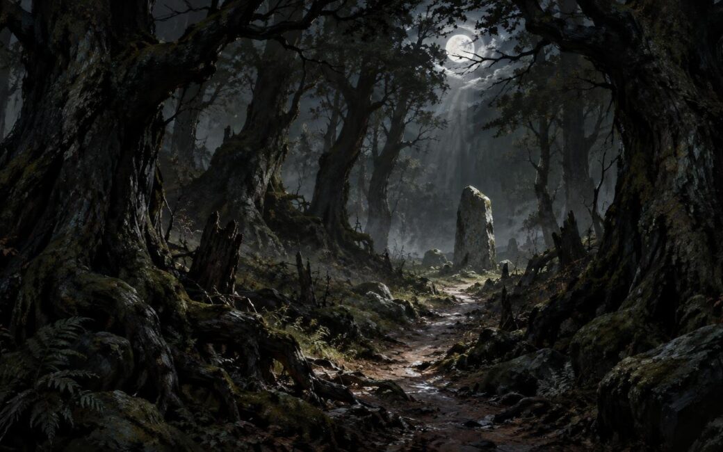
TLDR
To understand how to paint a dark fantasy forest without losing atmosphere, treat darkness as selective concealment rather than a blanket of black paint. Begin with three to five value groups, divide the forest into depth planes, and reserve the strongest contrast, sharpest edges, and clearest details for one focal event. Build trees as overlapping masses before adding trunks or foliage. Soften and simplify distant forms, place mist between selected layers, and remove any highlight or texture that competes with the focal point.
A convincing dark forest does not show everything equally. It gives the viewer one clear route into the scene while allowing other forms to emerge slowly or remain unresolved. The central question is not simply how dark the painting can become. It is which information must survive the darkness.
Decide what the darkness is allowed to hide
Before painting, establish a visibility rule. Decide what the viewer should recognize immediately, what should become apparent after a few seconds, and what should never fully resolve. This hierarchy creates mystery without sacrificing readability.
The immediate read might be a pale path beneath an arch of trees, a ruined doorway, a moonlit pool, a lantern-bearing figure, or a magical glow behind tangled roots. Secondary discoveries could include a distant tower silhouette or a shape that might be a creature. Bark patterns, scattered leaves, and minor branches can remain submerged in shadow.
Also choose a lighting condition. A moonlit nocturne, dim gothic daylight, red magical illumination, and colorless fog all produce different value relationships. Avoid combining several unrelated lighting ideas unless one is clearly dominant. One governing source makes it easier to decide which planes are visible and which edges disappear.
Start with a small value thumbnail
Reduce the composition to three to five values before thinking about color. At thumbnail size, test whether the focal point remains visible and whether the forest reads as layered space rather than one dark wall.
- Place the largest dark mass. This may be the foreground canopy, a bank of trunks, or a framing shape along one side.
- Establish a middle value that separates important trees, ground planes, mist, or architecture from the darkest mass.
- Choose one lighter opening or illuminated form to direct attention.
- Add a small, controlled dark accent inside or beside the light area if the focal subject needs a stronger silhouette.
- Squint at the thumbnail or view it at a reduced size. If every shape merges, adjust the value groups before adding detail.
The lightest value does not have to be white, and the darkest does not have to be black. What matters is the relationship between them. A restrained range can feel deeply nocturnal if the focal contrast is clear. Conversely, a painting containing pure black and bright white can still feel flat when those extremes are scattered everywhere.
Build the forest as three depth planes
A practical starting structure is foreground, middle ground, and distance. More complex paintings may contain additional layers, but the three-plane model makes the first decisions manageable.
| Plane | Primary job | Useful treatment |
|---|---|---|
| Foreground | Frame the view and establish enclosure | Large connected silhouettes, cropped forms, limited internal detail |
| Middle ground | Carry the focal event and visual route | Clearest shapes, strongest useful contrast, selective texture |
| Distance | Extend the space and preserve uncertainty | Lower contrast, softer edges, simpler shapes, fewer details |
The foreground can be extremely dark, but it should still have a designed silhouette. A solid black strip across the bottom often feels pasted onto the painting. Instead, vary its contour with roots, rocks, hanging branches, or openings that point toward the middle ground. Negative space is as important as the trees themselves.
Use overlap and changes in apparent scale to clarify which forms sit in front of others. The Getty’s landscape teaching materials identify overlap and relative scale as spatial cues, while its description of atmospheric perspective includes reduced detail, softer outlines, lower contrast, and shifts in saturation or color in distant forms. The Getty’s landscape curriculum provides a useful overview of these depth devices. For a broader application of the same principles, see this guide to creating depth in fantasy landscapes.
Paint tree masses before individual trees
Repeated vertical trunks can make a forest resemble a fence. Begin instead with connected masses: a dense canopy shape, a leaning wall of growth, an arch over the path, or a cluster broken by a narrow opening. Cut trunks and branches into or out of those masses only after the large pattern works.
Vary the rhythm of the verticals. Combine thick and thin trunks, alter their spacing, interrupt some with shadow, and let others merge into the canopy. A few diagonals can imply fallen limbs or unstable growth, but too many create visual noise. The goal is organized irregularity rather than random marks.
Silhouette design can carry much of the fantasy character. Narrow, upward-reaching forms may feel severe or cathedral-like. Low, interlocking boughs can make the space oppressive. Exposed roots can direct the eye like paths, while rounded masses create a quieter, older woodland. These are visual effects, not fixed emotional rules, so test them against the specific story of the scene.
Use atmospheric perspective without turning everything blue
Atmospheric perspective is often reduced to the advice that distant forms should become lighter and bluer. That can work in daylight, but it is not a universal formula. In a dark fantasy forest, recession may come primarily from reduced contrast, softer edges, less saturation, and simpler silhouettes. The distance can remain dark if it is still differentiated from the foreground.
For example, a near-black foreground trunk might sit against a muted middle-ground fog bank. Behind that, distant trees could be a narrow range of cool gray-green values. The distance is not necessarily bright; it is simply quieter. If the background contains sharper edges and stronger contrast than the focal middle ground, it may jump forward regardless of its color.
A useful test is to compare adjacent planes. If the foreground, middle ground, and distance all have the same value range and edge sharpness, depth will collapse. Change at least two variables between the planes: contrast and detail, edge and saturation, or scale and overlap.
Make edge control carry the atmosphere
Edges determine how quickly the eye identifies a form. Hard edges feel immediate. Soft edges suggest haze, low light, movement, or distance. Lost edges allow a form to merge into its surroundings, leaving the viewer to complete it.
Keep a few decisive edges around the focal area, especially where the subject crosses a contrasting background. Elsewhere, break contours with foliage, shadow, mist, or textured transitions. Avoid tracing every trunk with the same crispness. That turns atmosphere into diagram.
Edge variety can also prevent a dark foreground from becoming a dead shape. Let part of a trunk disappear into the canopy, recover its contour where it crosses a dim sky opening, and lose it again near the ground. The viewer still reads the tree, but the sequence of found and lost edges makes the darkness feel spatial.
Place mist between forms, not over the whole painting
An even gray veil usually reduces depth because it affects every plane in the same way. Treat mist as a shape occupying the environment. It might settle along the ground, pass behind one trunk and in front of another, collect above water, or stream through a gap in the canopy.
Paint the forest structure first, then use mist to interrupt selected forms. Preserve some clear darks in front of it and allow quieter silhouettes to recede behind it. Its outer boundaries should vary: one edge can be soft and diffuse while another becomes more visible where the mist crosses a dark trunk.
Mist can also guide the composition. A pale band curving toward a ruin creates a visual route, while a horizontal fog stripe may stop the eye. Design its direction rather than treating it as a final atmospheric effect.
Ration moonlight or magical light
Selective light is more ominous than universal rim lighting. Decide what the source can plausibly reach, then reveal only the planes necessary for the scene. A moon gap might catch the upper edge of a path and one side of a ruin while leaving nearby trunks unresolved. A lantern should create a compact zone of visibility rather than outlining the entire forest.
Caspar David Friedrich’s circa 1823–30 Forest Interior by Moonlight offers a useful historical reference for studying a shadowed forest interior against a more illuminated distance. The point is not to copy its arrangement, but to observe how a limited light event can give dark foreground forms a readable context.
Magical light permits more stylization, but it still benefits from rules. Choose a source position, decide whether the light is direct or diffused, and repeat its hue only in limited reflections. If every branch receives an equally bright colored accent, the glow becomes decoration rather than illumination.
Keep color subordinate to the value structure
Dark shadows do not need to be made from black alone. A limited family of deep blue-green, violet-brown, muted green, or neutral gray can maintain color relationships inside the darkness. The exact pigments or digital brushes matter less than preserving clear value groups.
Use temperature and saturation to reinforce the focal hierarchy. A restrained cool forest might contain a small warm lantern, while a muted neutral woodland could hold one saturated supernatural accent. Do not rely on vivid color to repair an unclear composition. If the focal point disappears in grayscale, its value relationship probably needs attention.
Friedrich’s circa 1825 Northern Landscape, Spring is another institutional reference worth examining for its restrained palette, mist, and differentiated treatment of near and distant forms. These observations can inform a fantasy scene without implying that the historical work shares the same narrative purpose.
Finish with subtraction rather than more detail
Dark fantasy paintings often lose atmosphere late in the process because every empty area begins to look unfinished. The artist adds bark lines, leaf clusters, sharp twigs, reflected light, and small glowing objects until the original hierarchy disappears.
Make the final pass subtractive. Reduce unnecessary contrast, merge minor shapes, glaze or repaint distracting textures, and soften edges outside the focal zone. Ask whether each visible mark supports depth, directs attention, or strengthens the story. If it does none of those things, it may be weakening the image.
- Remove isolated bright accents near the outer edges unless they intentionally lead the eye.
- Merge small shadow gaps into larger connected masses.
- Soften distant trunks that have become as sharp as foreground forms.
- Reduce bark and foliage detail outside the middle-ground event.
- Check the painting at thumbnail size to confirm that the focal route still works.
Troubleshooting common dark-forest problems
The foreground looks like a flat black cutout
Redesign its silhouette and add only a few internal value changes. A barely visible root plane, overlapping trunk, or reflected edge may be enough. Do not brighten the entire foreground.
The shadows look muddy
Re-establish the large value groups instead of mixing more colors into every passage. Mud often results from uncertain hierarchy: too many near-identical darks are being adjusted independently. Reconnect them into broader masses, then introduce limited variation where it describes form.
The forest looks like rows of symbols
Group trunks into irregular clusters, vary their spacing and width, and obscure some with canopy masses. Use overlap so the viewer reads layers rather than a collection of separate tree icons.
The fog has covered everything
Restore clear foreground darks and break the fog into localized shapes. Let it pass behind some forms and in front of others. That alternation is what makes the fog occupy space.
Too many things are glowing
Choose one primary light event and demote the others. Lower their saturation, reduce their surrounding contrast, or remove them. A mysterious forest usually becomes more convincing when illumination feels scarce.
A practical order of operations
- Write a one-sentence visibility rule for the scene.
- Make several small three-to-five-value thumbnails.
- Choose the clearest focal route and divide it into foreground, middle ground, and distance.
- Block in large tree and canopy masses without texture.
- Establish the main light opening or illuminated subject.
- Differentiate the planes through overlap, contrast, edge quality, scale, and detail.
- Add mist only where it clarifies layering or guides the eye.
- Introduce a limited color-temperature or saturation accent around the focal zone.
- Add a small amount of descriptive texture near the focal area.
- Finish by removing competing edges, highlights, and details.
Let controlled visibility create the mood
The strongest answer to how to paint a dark fantasy forest without losing atmosphere is to ration visual information. Darkness establishes enclosure, but contrast creates the route. Silhouettes establish character, while overlap and atmospheric perspective create depth. Mist interrupts selected forms, and edge control decides what the viewer discovers first.
Before adding another branch or highlight, return to the visibility rule: immediate, delayed, or unresolved. That single decision can keep an ominous forest readable without explaining away its mystery.